Assignment 5: People and place on assignment

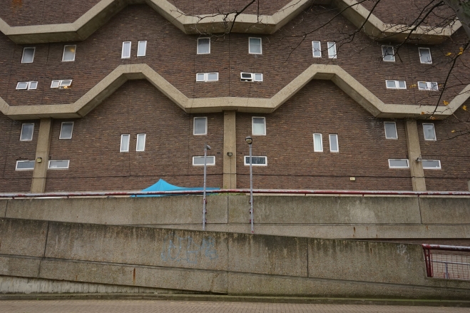
For the final assignment of the course, I decided to investigate one of London’s rapidly changing council estates. I photographed a variety of areas, including estates in Poplar, Ladbroke Grove and Elephant and Castle. My inclination to shoot on these estates – particularly those built in the brutalist/modernist style common during the 1960s – stems from an interest in the historical and social context within which they were constructed, and also from the fact that many (if not all) are on the verge of significant regeneration or demolition. With today’s housing crisis in London and the reluctance of local authorities and the national government to take action against the vast property investment that continues to make home ownership and renting unaffordable, examining the history and ideas behind these huge mid twentieth century estates is, in my view, taking on greater and greater relevance.

Photographing these estates can at times be a sad experience, particularly those that show signs of significant neglect, vandalism and petty crime. However the ideas behind their design were certainly benign – clean, modern and affordable housing for people living in the overcrowded slums of inner London. At some point however, the urban planners appeared to forget they were designing housing for people, and soon many of these estates (despite their acclaimed architectural design) became synonymous with dystopian visions of urban collapse, alienation and crime. What went wrong and what caused this reputation? Was it the design of these estates that doomed many of them?

Initially I considered attempting to knit together images from a variety of estates, however with a 8-12 image brief in mind I decided to focus on one estate. I selected the Thamesmead area in southeast London for a number of reasons. Firstly it forms one of the most extensive estates in the Greater London area, and is therefore one of the best examples of 1960s modernist architecture. Secondly, it is somewhat different in it’s use of water (lakes and canals) and other landscape features. The Greater London Council architect Robert Rigg was inspired by housing complexes in Sweden that believed in the idea that lakes and canals reduced vandalism and crime, particularly among younger residents. Thirdly the area is known for it’s use of elevated walkways and raised ‘streets’ so that most of the residences on the estate occupy the first floor and above. The reason for this was the flooding of the area during the 1953 North Sea flood, and so resulted in quite a uniform design feature.

I researched the area and photographed a number of locations, and was immediately struck by how the design of the structure, particularly the elevated walkways and facades impacted the public space on the estate. I therefore formulated a ‘client’ brief based on this research:

A local borough council are seeking the services of a photographer to investigate the impact of architectural design on the public space in a council estate. They are currently assessing the 1960s designed council housing in Thamesmead, hoping to take this evaluation into account when the local councillors meet to propose a regeneration plan for the area. The councillors are particularly interested in the photographer finding evidence of both positive and negative design characteristics, and to show the impact of these on public space. Whilst the expectation is that the focus of the brief will be on the local architecture and urban space, the photographer may produce other findings deemed relevant for the councillors to consider when formulating a future proposal for the Thamesmead area.

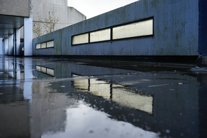
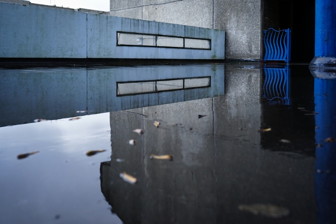
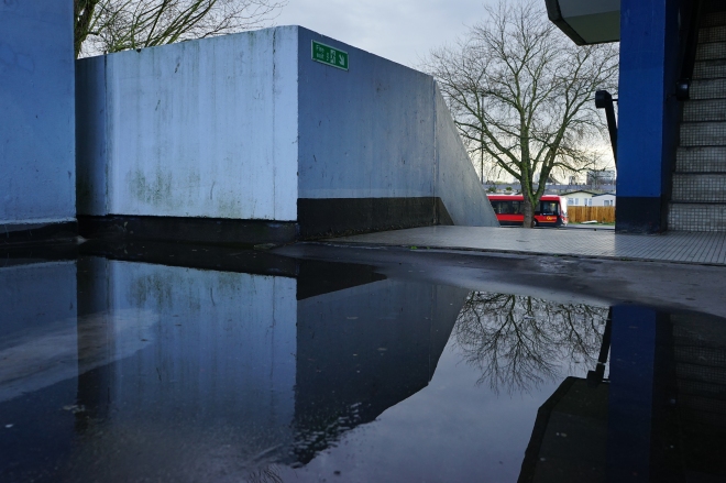
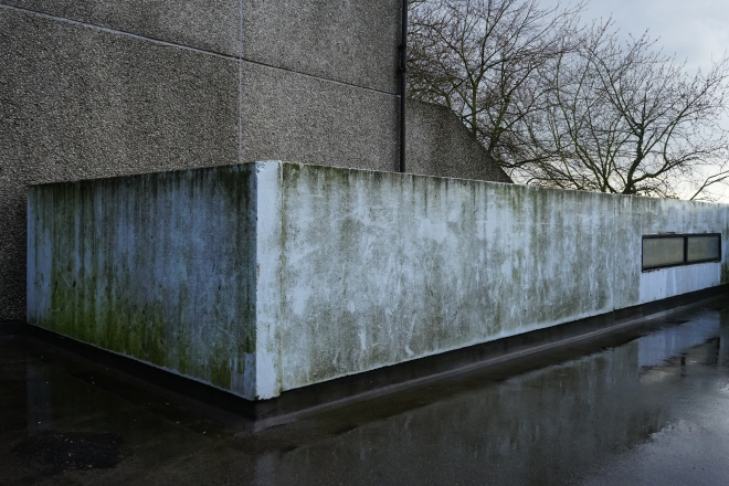
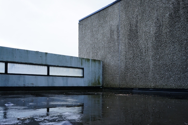
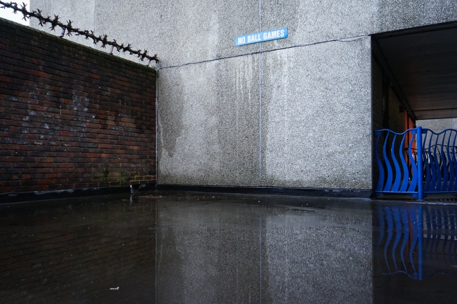
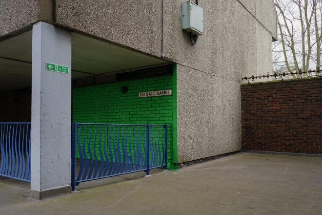
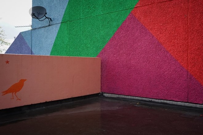
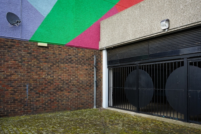
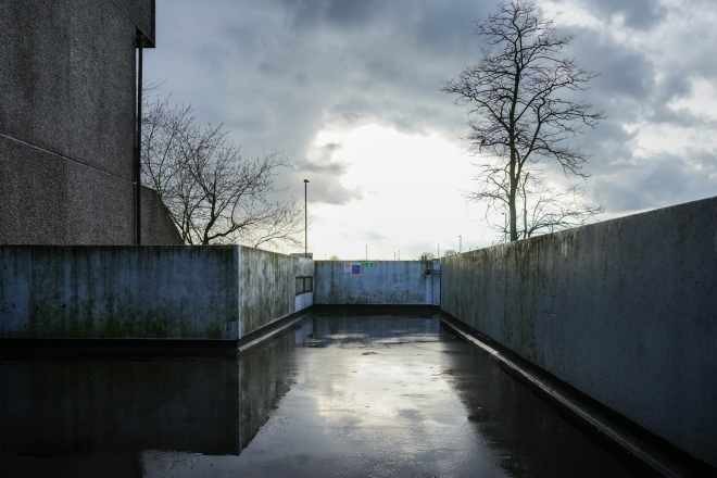
Once I had settled on an idea and written the brief, I found it much easier to approach the assignment. As I walked around the Thamesmead area I was able to plan the photos effectively by referring back to the brief. During my research on the estate, I discovered that one of the first complaints by residents after moving in was rain penetration problems inside a number of the residences. Already this proved the inadequacy of concrete for large scale housing, but its flaws became even more pronounced over time. Concrete is prone to moss and lichen growth and cracks easily, and this is something very noticeable upon the estate’s material facade. Another frequent criticism was the dimly lit walkways and inadequate drainage rendering many of the residences inaccessible. In light of this research, I settled on shooting a particular stretch of one of the elevated ‘streets’ on a day of wet weather. I had considered producing a series of black and white images, but I opted for colour images to present a more objective set of images that departed from the standard portrayal of these estates by photographers. As with my previous assignment on Brixton, I chose to use my digital camera to allow for a quicker review and reflection on the images produced. The final 12 images are arranged in order below.
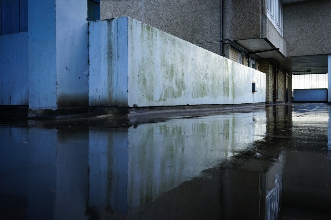


ThamesmeadDigitalFinal


ThamesmeadDigitalFinal-2


ThamesmeadDigitalFinal-3


ThamesmeadDigitalFinal-4


ThamesmeadDigitalFinal-7


ThamesmeadDigitalFinal-5


ThamesmeadDigitalFinal-6


ThamesmeadDigitalFinal-12


ThamesmeadDigitalFinal-9


ThamesmeadDigitalFinal-10


ThamesmeadDigitalFinal-11


ThamesmeadDigitalFinal-8


* All images shot on Sony A7 with 28-70mm zoom lens – using variable apertures from F3.5-F8 with ISO set to approx. 400-1600 


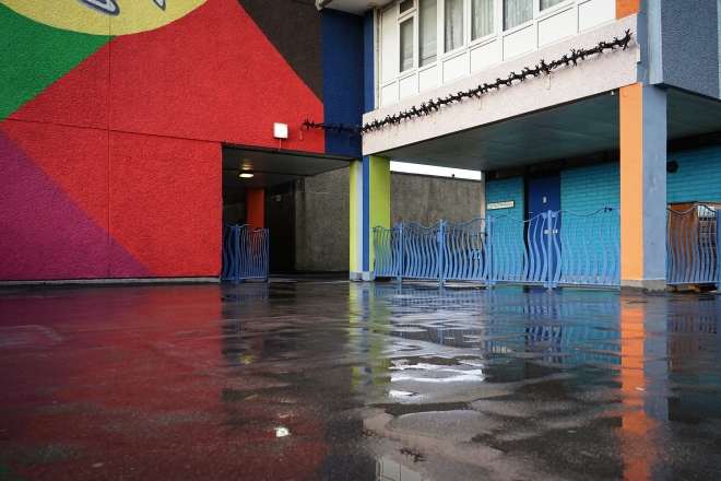
Overall I feel the final set of images fulfils the brief and actually reveals more than expected by the ‘client’. It highlights poor design characteristics such as using concrete as a building material (evidence of moss growth and cracks in many of the images), flooded and poorly lit walkways, and also reveals how high walls block out views of the outside. The impact of these features on the public space in the images is dramatic. The viewer feels a sense of enclosure, almost as if the estate is a fortress against the outside world, and the absence of plant life or colour upon the facade does little to alleviate the barren concrete and two-tone world of the walkway. The images are effective in creating this impression of being blocked off from nature, as there are hints of trees overlooking the concrete walls and glimpses of the outside world are obstructed by barbed wire. Even upon the walkway there is little that makes the space inviting – the ‘no ball games’ signs, the barbed wire, the concrete walls and the flooded walkway deter rather than encourage the residents to use the space. Even so, there is evidence of a community. The images that show painted walls are a welcome relief from the dark, two-tone walkway. This demonstrates how even a simple splash of colour can alter a space and make it appear more inviting. It is also a sign of the individual and that within the cold, barren atmosphere of the walkway a community can still exist.

There were a number of difficulties encountered whilst I was carrying out the brief. One of the main difficulties was planning for the day of the shoot – once I had found the walkway I wanted to shoot I had to wait for a rainy day, and so waited some time (unexpectedly for England) for a weekend with bad weather forecast. Therefore shooting the assignment was perhaps not done as quick as it would have needed to be in a real life professional scenario. Another difficulty not unanticipated was the length of time it took to travel to the location. Whilst it did not impact me too much, I did realise in a professional context this would be quite impactful on the process.

I also allowed myself a period of reflection before selecting the final shots for submission. Taking the advice of my tutor, I shot mainly landscape oriented shots and I observed this made the final set feel more focused. I also decided to get some of the images printed (see previous blog posts in Assignment Five folder) and stuck them on my wall for a few days. This allowed me to see the images ‘together’ rather than individually on the computer screen, leading me to select shots with a similar style of composition – a decision I felt helped produce a more coherent final 12. I chose to include the shots of the painted wall towards the end of the set to introduce variety and to challenge the viewer’s perception of the location. Whilst the length of time I took for the process was unrealistic for a professional context, I felt I got to practice the stages of a professional assignment. The period of reflection was an especially important part of the process, and a stage I will employ in the future when discerning the final images to submit for an assignment.


Assignment 5: People and place on assignment

Assignment Five Research: Reviewing the set

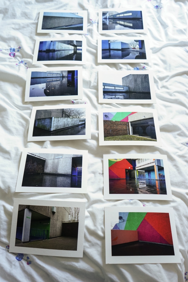
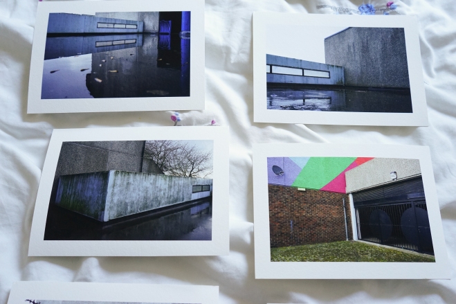
With the final submission date (27th May) looming, I took my tutor’s advice and decided to get some cheap(ish) prints of the images I was considering for submission. In the event I found a very affordable giclee printer here in London, so I thought why not and went for some prints on some very nice A5 ‘platinum etching’ paper. The images in question were the Thamesmead set posted in the previous post on the blog, a set of 16 shot on one of the elevated ‘streets’ common to the design of the estates in the area.

Having the images printed is certainly beneficial, particularly in seeing how the images work together (see below) and how I will present them in terms of order, sizing, and aspect ratio. I have already noticed things in some of the images that I haven’t noticed on the computer screen, and I may go back and rework some of the editing. While I will be spending the next couple of weeks reviewing the images and may get some more images printed, the final selection is already starting to take place and I have already cut some images. At this stage I can be 100% sure all the images will be presented in the normal 35mm aspect ratio in the landscape format. I do like how the images shot at a 45 degree angle lend a consistent feel to the set and I may keep this theme in mind when I do make the final selection.

Prints

I also feel the introduction of a wider colour palette toward the end of the set is effective (see the image on the bottom right above), however I am not 100% happy with these images and may return to Thamesmead one more time. These images could be reworked slightly to bring out the colours or to tighten up the composition. It will be worth editing on Lightroom before I make the decision to return to the location.

Prints-3

Above is a provisional selection for the final 12 images, however there are some changes to be made with certain images and I am not 100% happy with 5-6 at least.

If you are interested in some cheap and beautiful giclee prints and you are in the UK, try Zheeklay printing: http://www.zheeklayprinting.co.uk/

Assignment Five Research: Reviewing the set

Assignment Four: Reflection

As part of the post-assignment reflection, I reworked the images I shot for the assignment into a new series. One of the suggestions my tutor made for future assignments is reviewing how images work together in a set, as well as how things like format and aspect ratio can affect this.

I chose the 11 images below as I think they present a set of images that flow better together than the set I submitted. One of my tutor’s points was that the landscape images appear to have stronger compositions – in hindsight, the stronger images do appear to be the landscape shots as they make better use of their elements, and it might have been preferable to submit shots in the same format to maintain uniformity within the set. However it must be said this is not something to be assumed with every set of images, but keeping the same format is worth considering for future projects. See the reworked set of images below.

brixtonBrixton2-11Brixton2-12Brixton2-3Brixton2-4Brixton2-9Brixton9Brixton7Brixton4Brixton3Brixton6

Looking ahead to the final assignment, one of the underlying points from my tutor’s feedback is to play to my strengths. With that in mind I will most likely be composing with the landscape format, unless I go for square crop images. Also points to takeaway from this and put into the process for the next assignment as I start my research are:

  • continue with the observational ‘flaneur’ approach
  • consider printing images (even cheap inkjet prints) when considering what to include in a final set
  • make the brief for the final assignment fit the images, not the other way around
  • consider using a tripod when composing landscapes
  • refine composition and think carefully about how the elements fit together within the frame

I expect my research for the final assignment to continue for at least the next month or so. I will post the results of my research on here as I go along, along with the results of my research from reading the course books and online materials.

Assignment Four: Reflection

Part Four Research: Brixton (2)

Introduction

The results of my second photo walk in Brixton. Continuing with the “laneur” approach of the previous walk, I shot to gain a greater visual variety and with more focus on the variety of gentrification in the Brixton area.

Brixton2-2

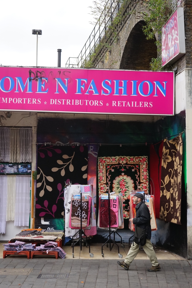
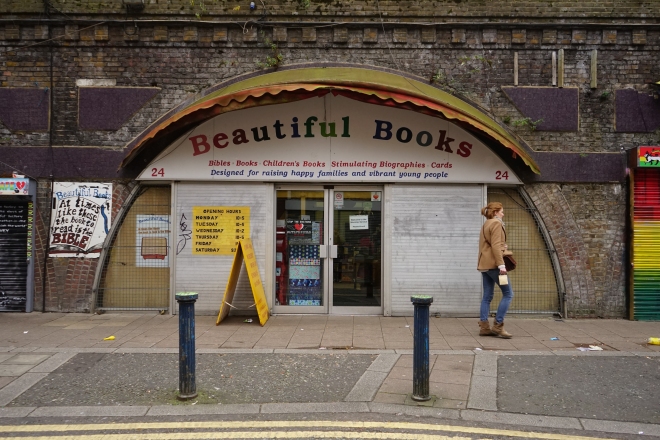
The above image was taken in the Brixton arches where a variety of small businesses continue to run. There are proposals to refurbish the arches by network rail, and there are fears from the proprietors that they will be forced to move away. The image itself is a well executed shot, I liked the composition which shows the small retail business behind the man in the foreground, as well as the arches in the background.

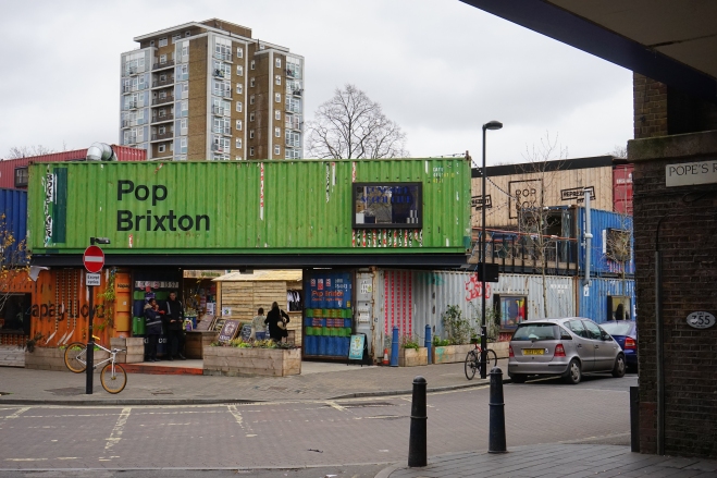
Brixton2-3

The following image shows “Pop Brixton”, which contains restaurants in restored shipping containers. Whilst it is sign of Brixton’s ‘regeneration’, it is different in that it attempts to foster a community feeling by encouraging local tenants to get involved in start-ups. This will be a location that I will return to, perhaps getting some photos of the tenants and the businesses themselves. It could be an interesting point in the narrative perhaps, showing regeneration that tries to be a positive force in the community it serves.

Brixton2-4Brixton2-5

Brixton2-7

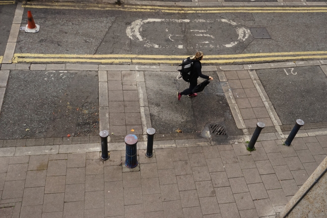
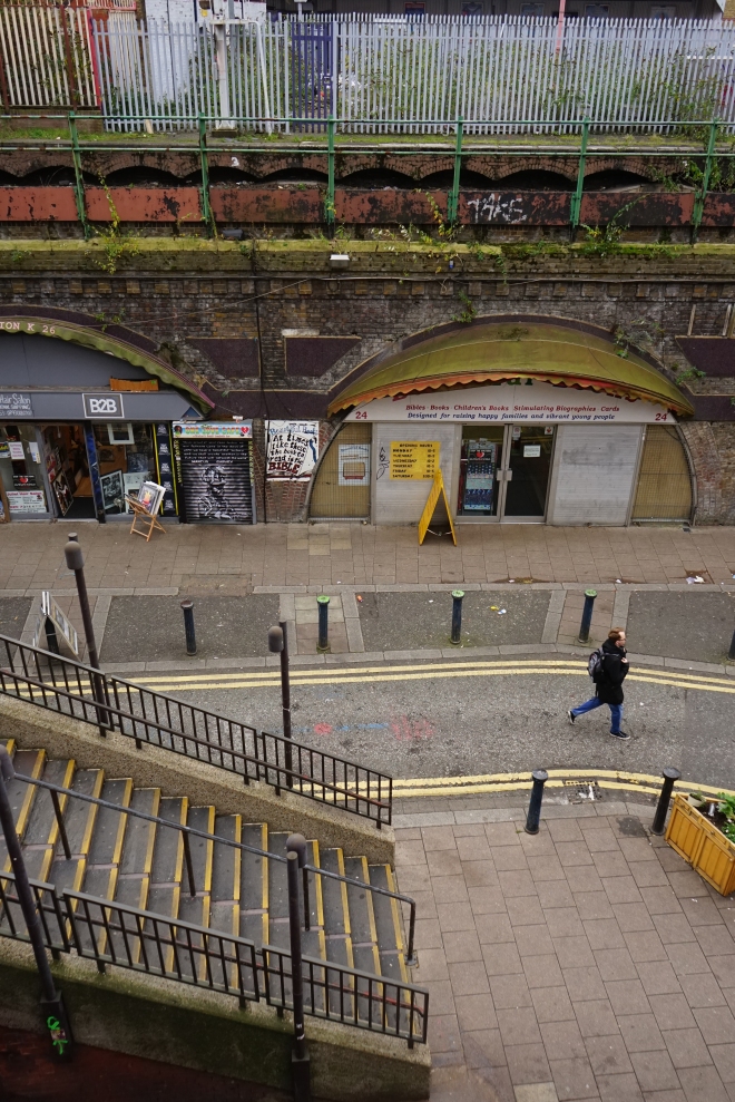
The proceeding three images attempt to employ some of the visual approaches specified by the assignment brief. These demonstrate the ‘single figure small’ approach – keeping the distant figure anonymous and experimenting with balance by placing the figure at different points within the frame. I feel the second images works very well, there is a strong sense of movement conveyed to the viewer by the moving figure. I’m not convinced that any of these add anything to the narrative or the brief I am trying to fulfil. It would be interesting to get a similar vantage point overlooking the arches, the market on Electric Avenue or overlooking a busy part of Brixton.

Brixton2-8Brixton2-9

The next two images attempt to show some more of the arches – perhaps businesses that have been in Brixton for much longer than areas like Pop Brixton or the rejuvenated Brixton Village. The composition is good on both, but is perhaps lacking in visual variety and it is difficult to see where they would fit into the narrative. I will also return to the market next time to document some more of the businesses and local people.

Brixton2-10

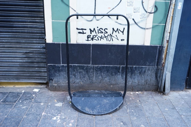
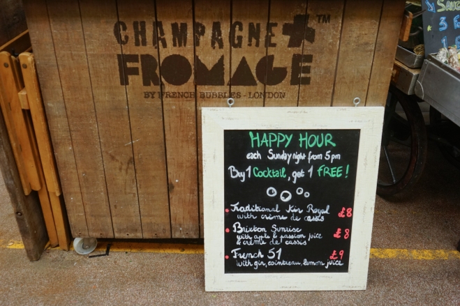
The image above is from within the rejuvenated Brixton Village, once a local fruit and veg market but now hosting a huge array of cafes, restaurants and bars. The epitome of this change I thought was encapsulated by the appearance of the French champagne bar (right opposite one of the fruit and veg sellers still clinging on). I thought a diptych or sequencing this image with the “I miss my Brixton” graffiti photo I shot on the previous post would be an interesting narrative.

Brixton2-11

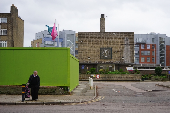
Photographing some of the residential areas around the main retail and going out areas has also been an idea. Photographing some of the estates under threat of demolition – for example Loughborough Park where the Guiness Trust Housing Association is located – could be another interesting angle to introduce to the narrative. Contrasting this with recent developments containing less affordable housing could also make for an interesting contrast.

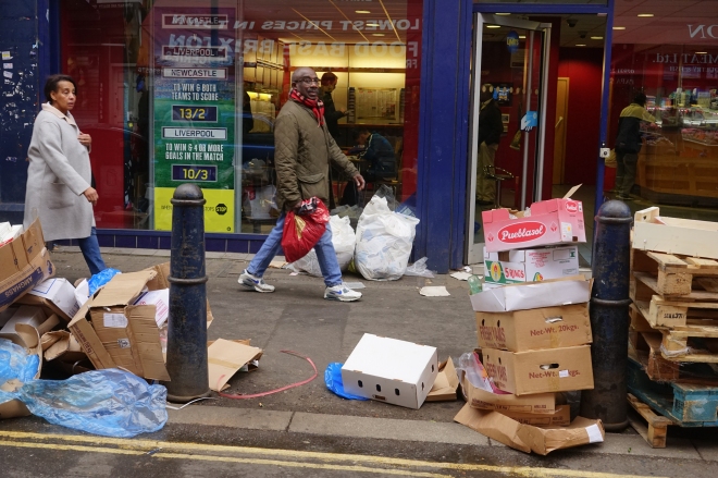
Brixton2-12

The final image in this set was taken on the Electric Avenue. I haven’t really photographed much around here so I will return again and try out some new angle perhaps focusing on the local businesses. The shot above attempts to convey some of the chaos of the street, whilst also experimenting with balance in the frame. I felt this could have been stronger without the woman encroaching on the left, but otherwise the composition feels safe despite the messy street.

Conclusions

I felt I was more successful in documenting the variety of gentrification going on in Brixton, and I think a couple of further ventures experimenting with composition and visual variety will produce a great workflow to select the final 12 images from. The locations I will return to (and visit for the first time) include:

  • Pop Brixton
  • Electric Avenue
  • The Arches
  • Brixton Village
  • Loughborough Park (and the Guinness Trust)

Shooting this assignment on digital feels like the right choice, considering the approach I have taken to documenting the Brixton area over a few visits rather than one or two. The flexibility of a zoom lens (28-70mm) with a high performing ISO camera is also very convenient. I will stick with the traditional 35mm aspect ratio, and perhaps take full advantage of the ISO flexibility by shooting a few shots of the area at night.

Part Four Research: Brixton (2)

Part Four Research: Brixton

Introduction

Today I went on a photo walk around Brixton, my local area and a location I am considering for the next assignment. I had in mind some of the techniques and exercises practised in Part Four, but the main purpose was to consider Brixton as a place to focus on for the next assignment brief. Today was something of a trial run, and I will no doubt revisit some of the locations shot today over the next few weeks.

Brixton1

Brixton2

Brixton4

Brixton3

Brixton6

Brixton7

Brixton9Brixton8

Gentrification in Brixton

Brixton is an interesting place to photograph, particularly in light of the array of markets and shops catering to its multiethnic community. It has seen huge amounts of gentrification in recent years that has brought younger, middle class individuals to the area, attracted by the thriving arts scene and it’s proximity to central London. While the gentrification has breathed new life into the area, for example in the Brixton market which now contains independently owned cafes, bars and restaurants, it has also sparked controversy. Traders underneath the Brixton arches have been told to leave by Network Rail, or they face eviction by the end of the year. Traders are worried they will be unable to afford to return to the arches once the refurbishment is completed and that the arches will simply cater to Starbucks and Costa type establishments.

The changing face of Brixton could make for an interesting theme to run with and create a strong narrative, particularly by juxtaposing the gentrified areas of Brixton (such as the market) with locations that still continue as they have for decades (Electric Avenue). My photos today avoided shooting the gentrified areas and attempted to capture something of the essence of the original local community, that seems older and more grounded but also more vulnerable, and perhaps at risk of fading away. The first entrepreneur who opened in the market (Burnt Toast) commented:

“Compared to six years ago, we serve less than half the Afro-Caribbean and white families today than we did then. Either because they don’t live here anymore or it’s a weekend market now not a day trade market. Everyone comes here at night. We don’t get that young family folk that we used to during the day.” (Independent, 24th September 2015)

Conclusions

With this theme in mind, I will consider how best to communicate this narrative through a variety of images (6-12). Visual variety is an important factor to consider in the brief instructions, but I will also explore ways to present the material linking back to my earlier research on Gronsky’s presentation. For example, it might be useful to present images in diptyches or triptychs. I will also think about technique, whether I would like film (35mm or 120mm film), digital, and also aspect ratio. It will also be important to deliver a consistent style and format, and I will consider what kind of style I want and what best fits the subject matter and theme.

Part Four Research: Brixton

Part 3 Reflections

Having completed assignment three and had some time for reflection, I thought it useful to write up some conclusions I had from the process and provide some more background for the choice of locations and technique. In addition, this reflection should also reveal the rationale behind the final images I chose for the submission. I have included images I chose to omit to help illustrate some of the thoughts and conclusions I had about the final submission.

*Note that all of the images below were omitted from the final submission and should not be considered as part of assignment three

Ironically I found the most challenging part of the assignment photographing the most mundane locations, i.e. the shopping centre and library interior. Whilst working through the exercises and projects, I had set on a couple of locations for the assignment with quite obvious functions – a fairground and housing estate. What was interesting with the housing estate (Barbican set) was that as I got to know the location better, I began to see more uses and functions. I was also very taken in by its form and architectural design and found myself focusing too much on these aspects rather than the functional aspect of the space. Gradually I became aware that this was pulling my focus away from the assignment brief. The four images I selected showed various uses of the space, whereas those I decided to omit were either too similar to the ones I had selected, or were overly focused on form. A selection of those I decided to leave out are posted below.

Barbican-3 Barbican1

Barbican-5 Barbican-7Barbican-2  Barbican-6

One image I might have included was the park and the person walking across it. It shows part of the residential space of the estate but demonstrates a slightly differing function – a leisure space. This is something that could have been included in a larger project or series, but I decided that it was too similar to the residential uses I had shown in the other images. Also I thought it was perhaps a bit wayward of the assignment brief and was not focused enough on ‘building’ or the idea of a structure. However the idea of a leisure space is something that I found interesting and is an idea that I will come back to later.

The images of the Coney Island fairground I chose to omit were not particularly focused on the idea of a building in use. The ones I had chosen to include were rather a loose interpretation of the brief as well, but close enough to demonstrate a functional structure (for instance the ticket office. Again exploring this location again or one that I would have access to near to where I live would be an idea worth pursuing, perhaps fitting into the idea of a leisure/recreational space. A selection of images I chose to omit for the Coney Island location are below.

ConeyIsland-2 ConeyIsland-3 ConeyIsland-4 ConeyIsland

I felt the images of the outdoor cinema and the people on the benches were too loose an interpretation of the brief. I chose to select one image of the ferris wheel, the two I chose to omit were perhaps again too vague but I did enjoy the rather abstract capture of the roller coaster on the left. It would be interesting to see if it could fit into a larger project or more varied series of images focusing on a leisure/recreational space. Experimenting with visual narrative and finding “visual punctuation” in a series of images is something touched upon by Maria Short in ‘Context and Narrative’:

“It can be possible to achieve a certain pace in the series by using a particular size or shape of image at a key point in the sequence, either as a recurring theme or a one-off.” (Short, 2011, P.106)

Experimenting with narrative and presentation of images is something that I will be researching and attempting to do, certainly for the part four assignment and perhaps in a retrospective presentation of the images I made for the part three assignment. It would have been interesting to present the images I made for assignment three in a less uniform way, for example increasing the prominence of one image by increasing its size or messing with its aspect ratio. Observing the presentation of work by other photographers and how this can change visual narrative is something that I will come back to and research later.

My initial approach to photographing the shopping centre in Stroud can be seen in the images I chose to omit. I had the problem of shooting the complex’s obvious function when I first approached it and the resulting images were somewhat flat and uninteresting. It was after I had walked around the entire complex and saw how it fit into the Stroud town centre that I saw a function besides the obvious use as a shopping centre. The omitted images below show this function whereas those I chose to submit in the finished set demonstrate more creativity and a more interesting visual narrative.

Merrywalks-2

Merrywalks-3

Merrywalks

A takeaway point from this location (and that I considered immediately) is that it is always important to research and consider your location before approaching it. My intention when shooting Merrywalks was somewhat arbitrary, as I was thinking about its obvious function as a place to shop in. After walking around and considering its place within the town centre as a meeting point for young people, I approached the location in a more creative manner and I think the images I chose to submit possess a more engaging narrative for the observer.

This point was also very relevant with my approach to photographing the mills. It was only after I had shot a few frames and had considered how I could create a visual narrative for the audience that I approached the location in a different, more creative way. As I was shooting I found a potential narrative in juxtaposing the modern with the old. I saw the sports car parked under the Victorian railway bridge with the mill in the background, and saw the opportunity to contrast the modern office function with the traditional function of the mill as an industrial workspace. The images I omitted from the submission are presented below, and are devoid of any social/visual narrative I think is present in the set I submitted. Similar to my initial approach in photographing Merrywalks, the first frames I took at the mill are quite straightforward and only really show the original function of the buildings.

stroudmills-2 stroudmills-3 stroudmills-4 stroudmills

To conclude, I feel I approached this assignment in a much more thoughtful and creative way compared to assignment two. I was quite pleased with the submitted images for each of the five locations and I came away with some very useful learning experiences and ideas for future research. Although I have talked about these in the above text, I have bullet pointed the ideas below for ease of future reference.

  • It is important to research and walk around a location before shooting it and to consider how you would present the location in a series.
  • It is useful to ask yourself if there is any narrative present besides the obvious, and if you could approach photographing a location in a unique way.
  • Consider ways of presenting your final images in a set – are there subjects you could emphasise over others? How could you emphasise this within the set?
  • Could you change aspect ratio, size or bring in other visual aspects to achieve a visual punctuation within the narrative?
  • Taking away ideas such as leisure and recreational spaces, and how people interact with these spaces for my work/research in Part Four.

Having already done some preliminary reading for Part Four, these points are relevant learning experiences and ideas to bare in mind for work/research in Part Four. Although I am aware that the research and execution of assignment four may take a while, I am keen to keep up the momentum gained from Part Three and have already begun research for the next assignment and projects in Part Four.

Part 3 Reflections

Assignment three: buildings in use (Set 1)

BritishLibrary1Provisional

The first space I chose to focus on for assignment three was the British Library building in London. The library was built in the early 1970s and from the outside looks a fairly unremarkable architectural product of that era. I chose to use my digital camera with a 28-70mm zoom lens to retain some versatility towards shooting the space. I was also apprehensive about not having enough available light to shoot with so wanted a high ISO performing camera.

BritishLibrary2Provisional

The first photo above demonstrates a clear function – that the interior is set up primarily as a workspace. There are books and reference collections but upon entering the building the most striking feature is the organisation of the space into areas for work. There are alcoves and desks which are well lit for study, and the open area in the foyer is very well lit by natural light. When photographing the main foyer, I set out to show how the use of natural light, the floor tiling and the white walls give it a fresh and open feel – an inviting area to study in. All the images aim to show people using the space in the function it was designed for.

BritishLibrary3Provisional

The final image above looks into the building from a different vantage point. The camera looks away from the natural light of the main foyer and into the interior. This space has a very different feel, for example the alcoves and desks are artificially lit. Despite the absence of natural light, the artificial lighting is pleasant and ideally suited for study. The desks are positioned away from the main walkways to minimise distraction for those at study. This set shows both sides of the interior of the library and successfully shows how the space is organised into a functioning workspace.

Assignment three: buildings in use (Set 1)

Exercise: The user’s viewpoint (Part 2: on the tube)

Tube1

For the second part of the “user’s viewpoint” I opted for a similar space to the commuter set in the previous part. For those images I shot from the perspective of a commuter on a suburban train. I referenced Tom Wood’s series “Bus odyssey” which he shot over the course of the 1980s-1990s in Merseyside as providing some inspiration for these two separate sets.

Tube7

The key difference between the two sets is evident in the use of the space – the previous user being on the transport vs. the user waiting to embark on it. Whilst they are very similar I found the resulting images to be quite different. I noticed a lot of Tom Wood’s images had unusual and disordered compositions. I took this approach and ideas about perspective – that is shooting from the exterior environment of the transport. I chose the tube station platform and shot through the train window. The shot above and below are when the train is moving. I tilted the frame slightly to create the impression of movement and found that the blur also helped with this sense of movement.

Tube6

I found the results effective in conveying the fast moving train and the function of the space – waiting for the arriving train to stop and catching glimpses of the passengers on the moving train. I quite liked some of the moments I captured, although impressionistic and blurred, they are effective in capturing the function and atmosphere of a busy tube station.

Tube2

Tube3

Tube5

This (like the first part of the exercise) relied on luck and some guess work with composition for example I again relied on autofocus. But I found it a useful and refreshing exercise in putting into practice some approaches I liked from Tom Wood’s series. I would like to experiment with this space and perhaps use different shutter speeds, perhaps using longer exposures standing at the back of the platform, and giving myself more time to explore the possibilities and some different approaches.

Exercise: The user’s viewpoint (Part 2: on the tube)