Assignment 5: People and place on assignment

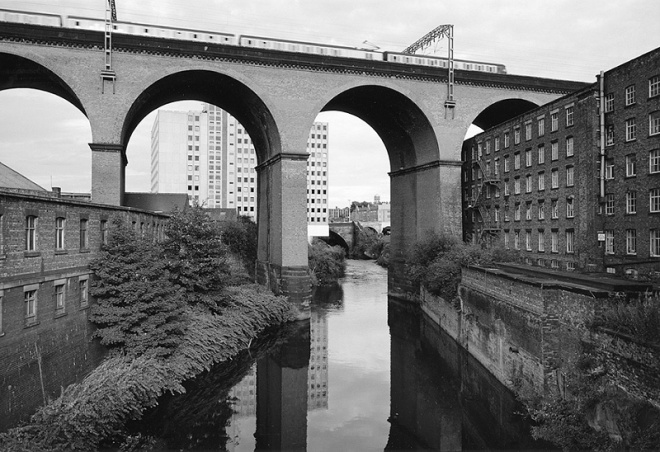
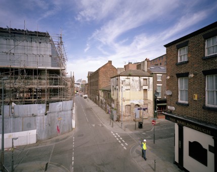
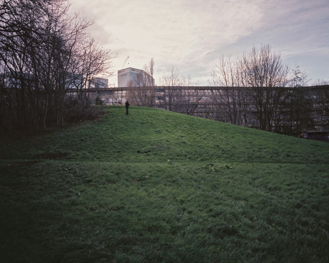
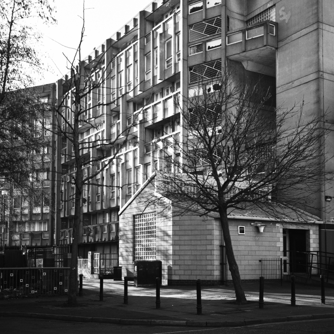
For the final assignment of the course, I decided to investigate one of London’s rapidly changing council estates. I photographed a variety of areas, including estates in Poplar, Ladbroke Grove and Elephant and Castle. My inclination to shoot on these estates – particularly those built in the brutalist/modernist style common during the 1960s – stems from an interest in the historical and social context within which they were constructed, and also from the fact that many (if not all) are on the verge of significant regeneration or demolition. With today’s housing crisis in London and the reluctance of local authorities and the national government to take action against the vast property investment that continues to make home ownership and renting unaffordable, examining the history and ideas behind these huge mid twentieth century estates is, in my view, taking on greater and greater relevance.

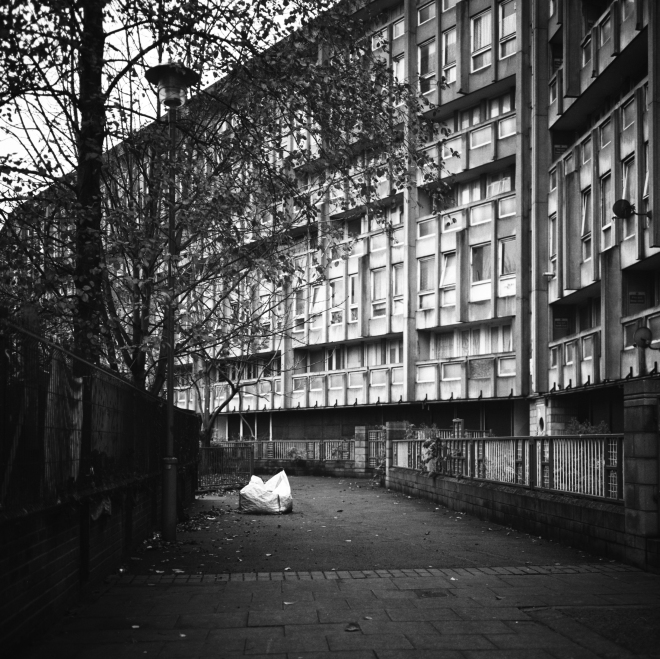
Photographing these estates can at times be a sad experience, particularly those that show signs of significant neglect, vandalism and petty crime. However the ideas behind their design were certainly benign – clean, modern and affordable housing for people living in the overcrowded slums of inner London. At some point however, the urban planners appeared to forget they were designing housing for people, and soon many of these estates (despite their acclaimed architectural design) became synonymous with dystopian visions of urban collapse, alienation and crime. What went wrong and what caused this reputation? Was it the design of these estates that doomed many of them?

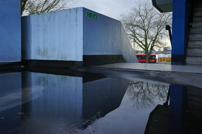
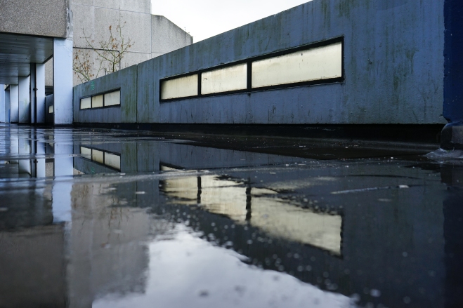
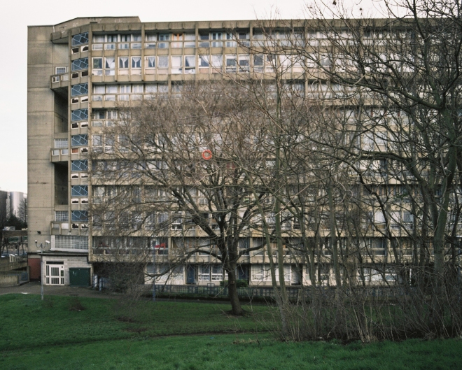
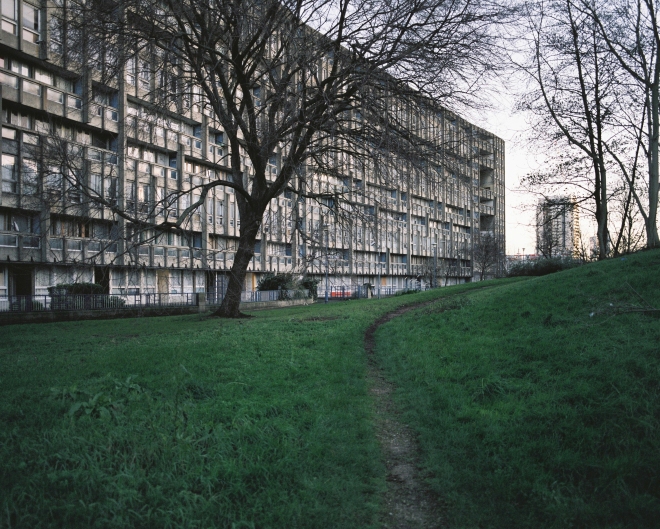
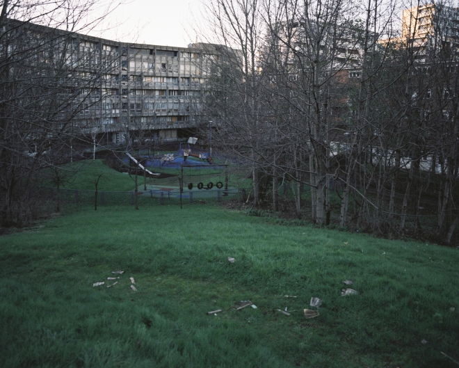
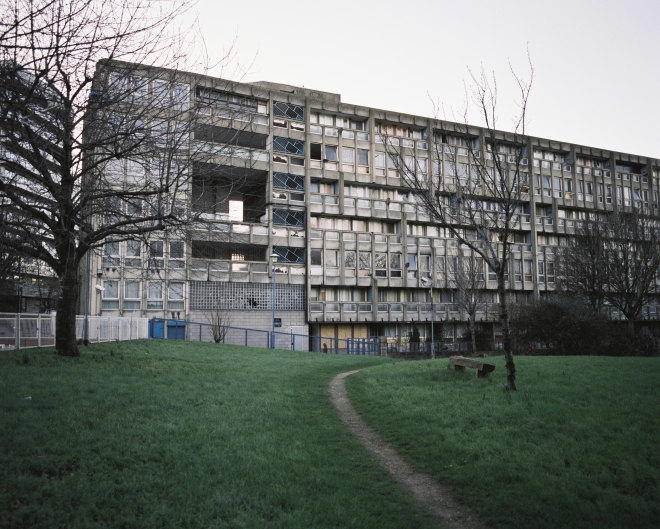
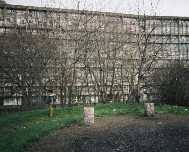
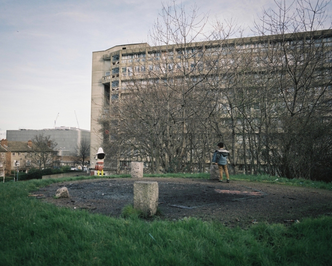
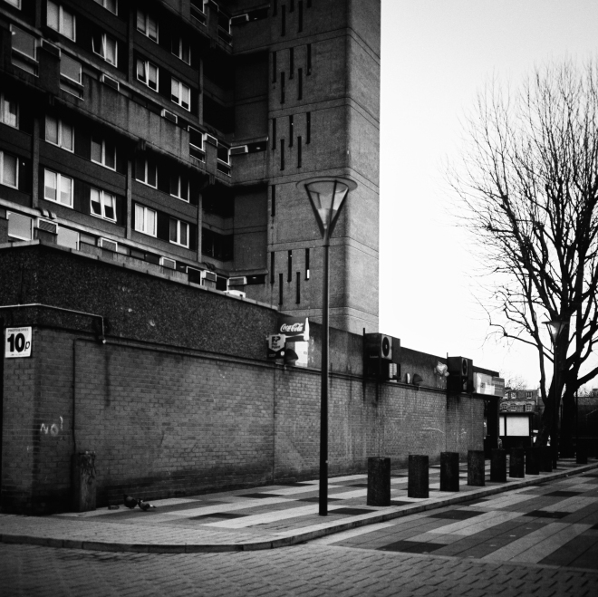
Initially I considered attempting to knit together images from a variety of estates, however with a 8-12 image brief in mind I decided to focus on one estate. I selected the Thamesmead area in southeast London for a number of reasons. Firstly it forms one of the most extensive estates in the Greater London area, and is therefore one of the best examples of 1960s modernist architecture. Secondly, it is somewhat different in it’s use of water (lakes and canals) and other landscape features. The Greater London Council architect Robert Rigg was inspired by housing complexes in Sweden that believed in the idea that lakes and canals reduced vandalism and crime, particularly among younger residents. Thirdly the area is known for it’s use of elevated walkways and raised ‘streets’ so that most of the residences on the estate occupy the first floor and above. The reason for this was the flooding of the area during the 1953 North Sea flood, and so resulted in quite a uniform design feature.

I researched the area and photographed a number of locations, and was immediately struck by how the design of the structure, particularly the elevated walkways and facades impacted the public space on the estate. I therefore formulated a ‘client’ brief based on this research:

A local borough council are seeking the services of a photographer to investigate the impact of architectural design on the public space in a council estate. They are currently assessing the 1960s designed council housing in Thamesmead, hoping to take this evaluation into account when the local councillors meet to propose a regeneration plan for the area. The councillors are particularly interested in the photographer finding evidence of both positive and negative design characteristics, and to show the impact of these on public space. Whilst the expectation is that the focus of the brief will be on the local architecture and urban space, the photographer may produce other findings deemed relevant for the councillors to consider when formulating a future proposal for the Thamesmead area.

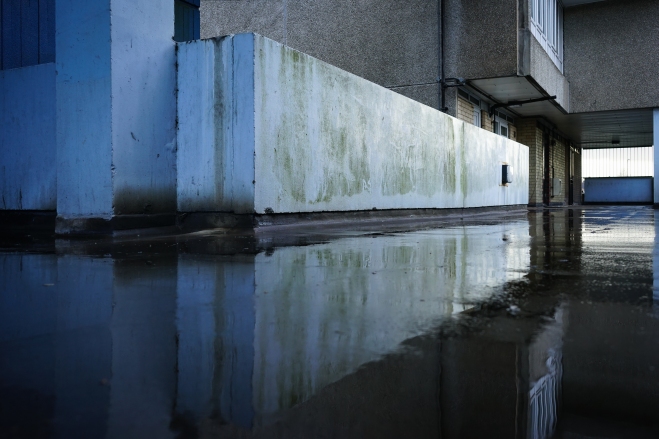
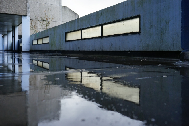
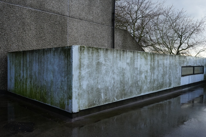
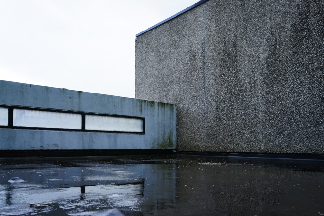
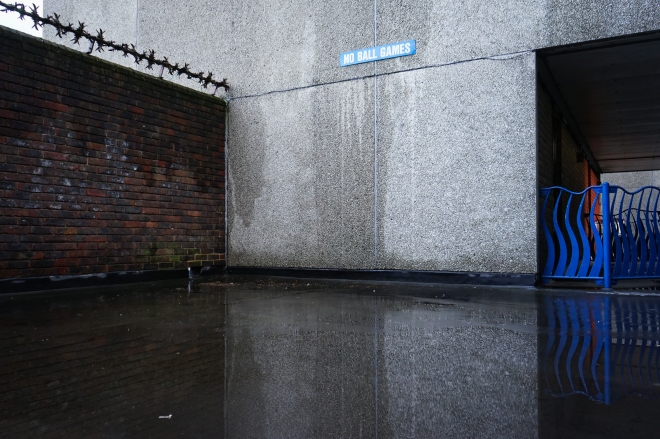
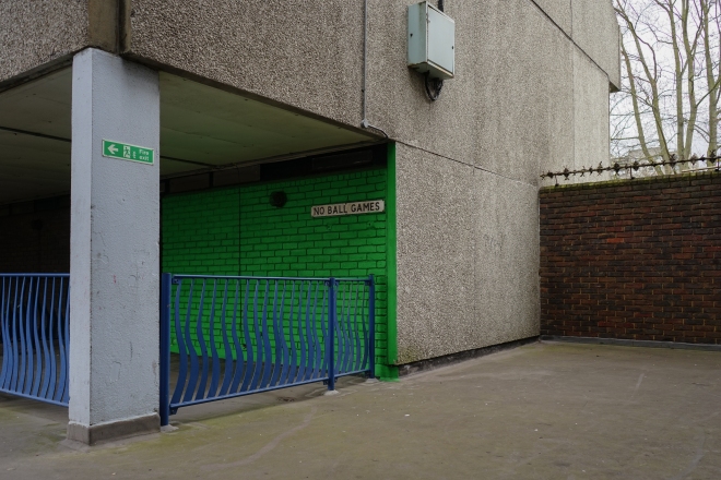
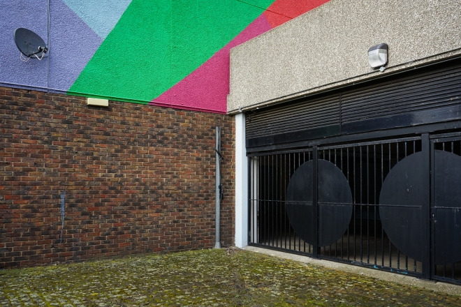
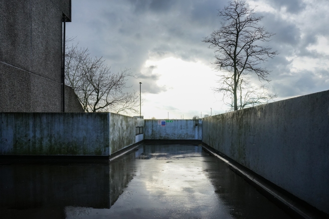
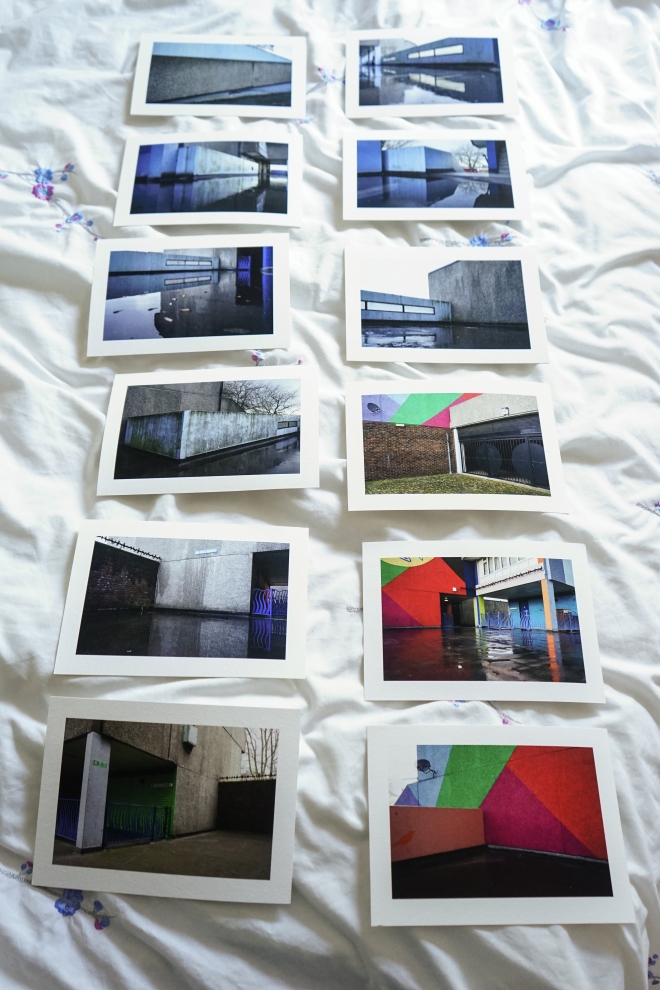
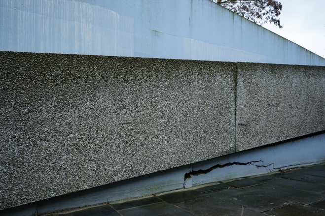
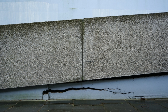
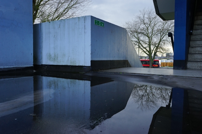
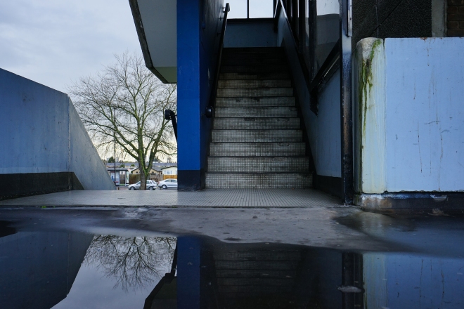
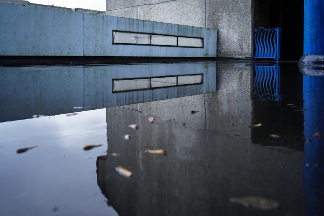
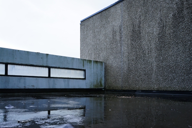
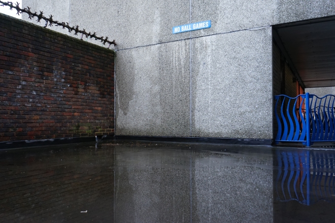
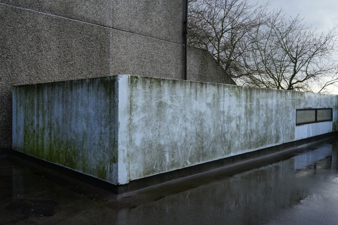
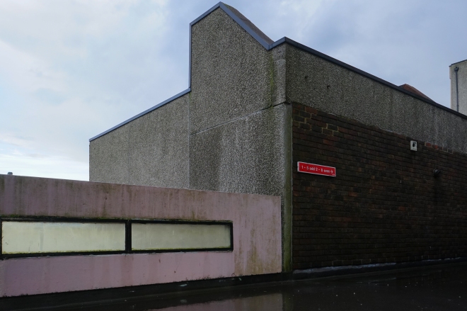
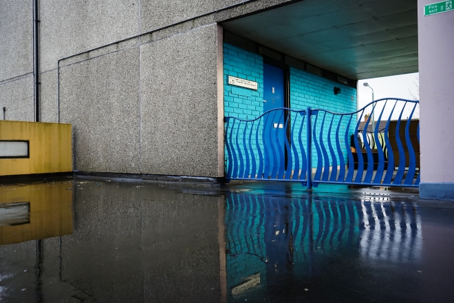
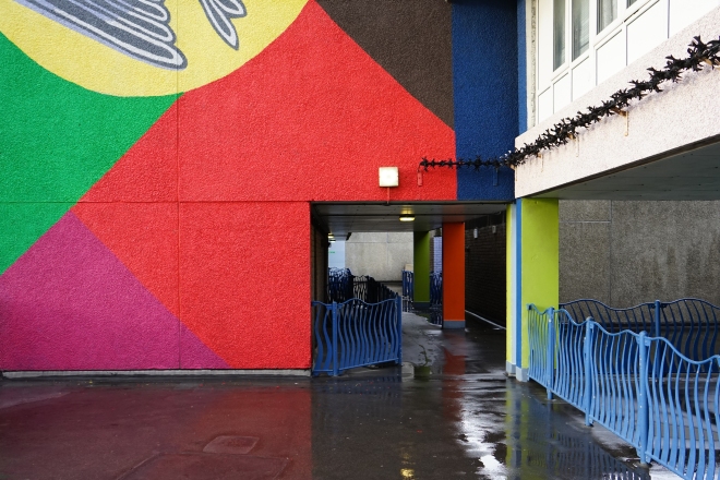
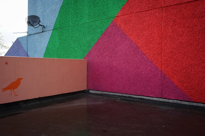
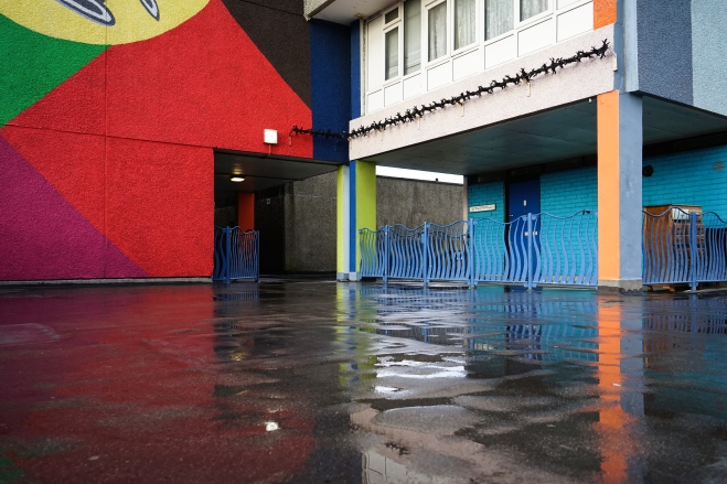
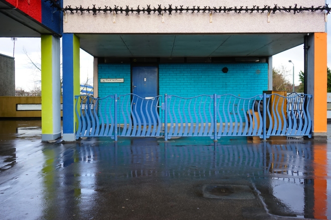
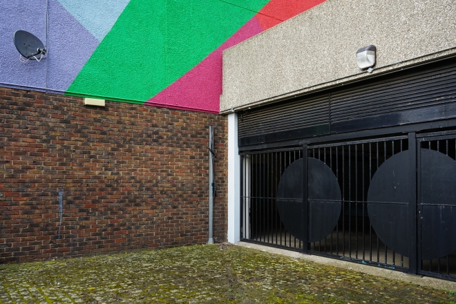
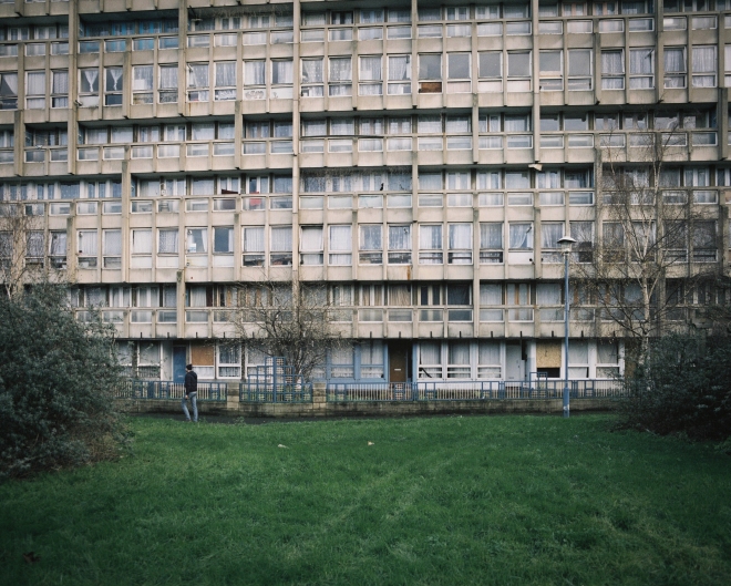
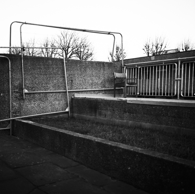
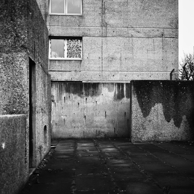
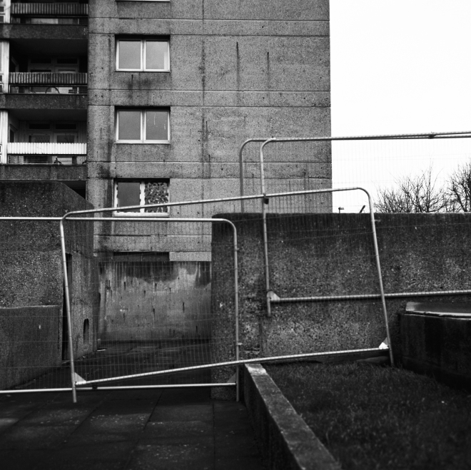
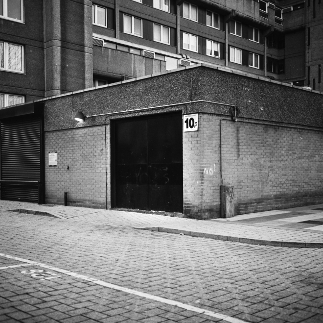
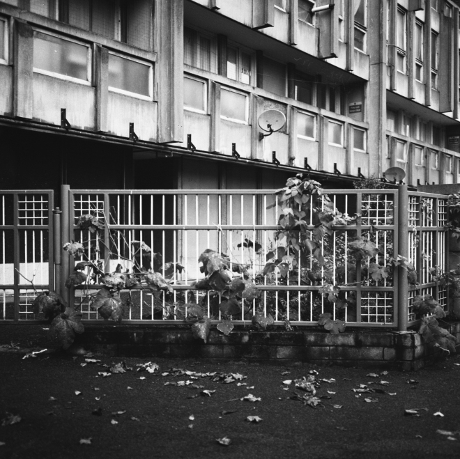
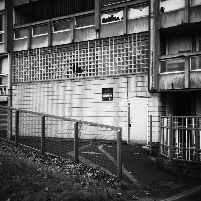
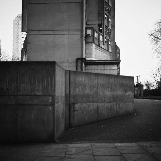
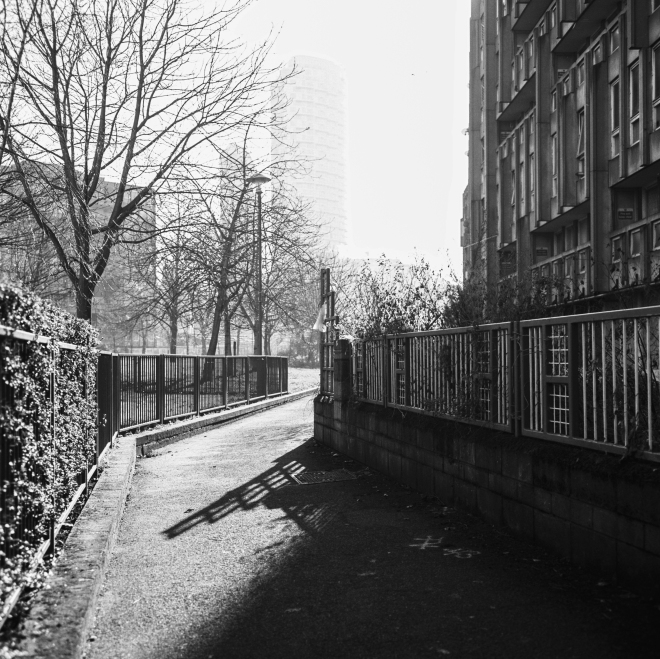
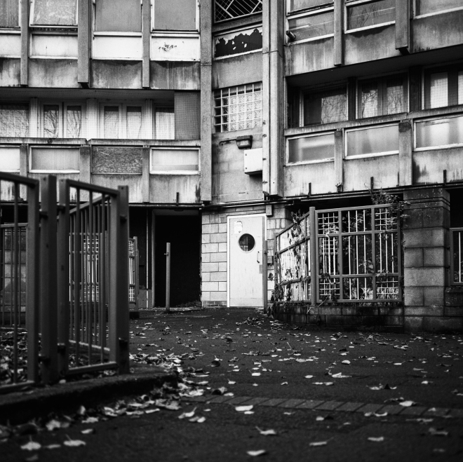
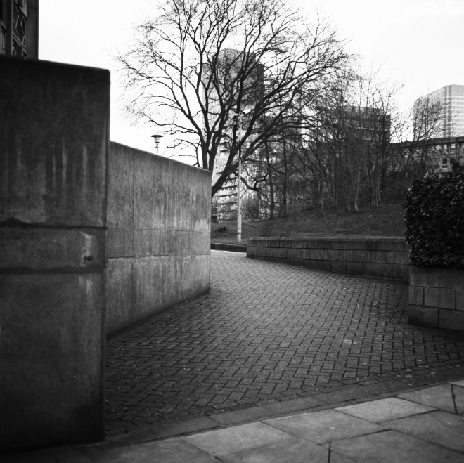
Once I had settled on an idea and written the brief, I found it much easier to approach the assignment. As I walked around the Thamesmead area I was able to plan the photos effectively by referring back to the brief. During my research on the estate, I discovered that one of the first complaints by residents after moving in was rain penetration problems inside a number of the residences. Already this proved the inadequacy of concrete for large scale housing, but its flaws became even more pronounced over time. Concrete is prone to moss and lichen growth and cracks easily, and this is something very noticeable upon the estate’s material facade. Another frequent criticism was the dimly lit walkways and inadequate drainage rendering many of the residences inaccessible. In light of this research, I settled on shooting a particular stretch of one of the elevated ‘streets’ on a day of wet weather. I had considered producing a series of black and white images, but I opted for colour images to present a more objective set of images that departed from the standard portrayal of these estates by photographers. As with my previous assignment on Brixton, I chose to use my digital camera to allow for a quicker review and reflection on the images produced. The final 12 images are arranged in order below.


ThamesmeadDigitalFinal


ThamesmeadDigitalFinal-2


ThamesmeadDigitalFinal-3


ThamesmeadDigitalFinal-4


ThamesmeadDigitalFinal-7


ThamesmeadDigitalFinal-5


ThamesmeadDigitalFinal-6


ThamesmeadDigitalFinal-12


ThamesmeadDigitalFinal-9


ThamesmeadDigitalFinal-10


ThamesmeadDigitalFinal-11


ThamesmeadDigitalFinal-8


* All images shot on Sony A7 with 28-70mm zoom lens – using variable apertures from F3.5-F8 with ISO set to approx. 400-1600 


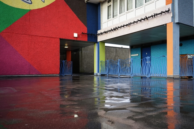
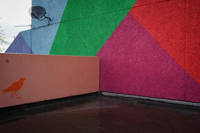
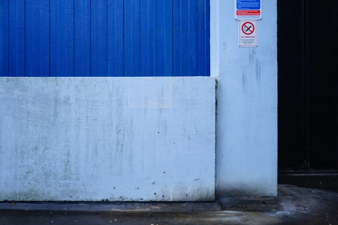
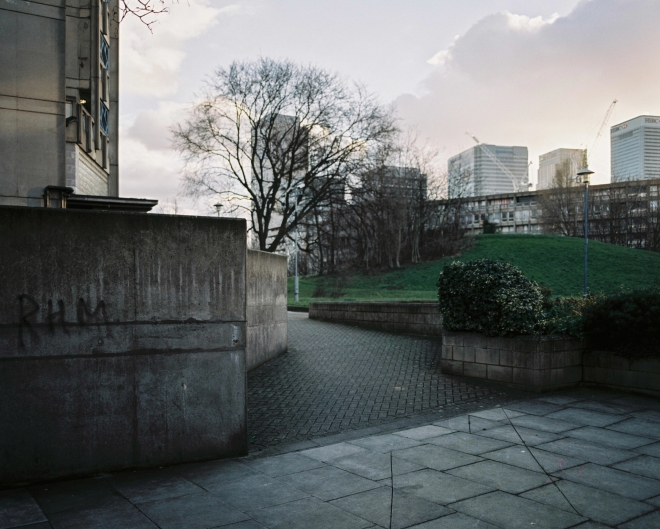
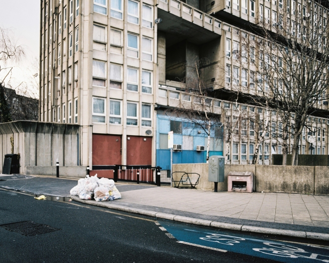
Overall I feel the final set of images fulfils the brief and actually reveals more than expected by the ‘client’. It highlights poor design characteristics such as using concrete as a building material (evidence of moss growth and cracks in many of the images), flooded and poorly lit walkways, and also reveals how high walls block out views of the outside. The impact of these features on the public space in the images is dramatic. The viewer feels a sense of enclosure, almost as if the estate is a fortress against the outside world, and the absence of plant life or colour upon the facade does little to alleviate the barren concrete and two-tone world of the walkway. The images are effective in creating this impression of being blocked off from nature, as there are hints of trees overlooking the concrete walls and glimpses of the outside world are obstructed by barbed wire. Even upon the walkway there is little that makes the space inviting – the ‘no ball games’ signs, the barbed wire, the concrete walls and the flooded walkway deter rather than encourage the residents to use the space. Even so, there is evidence of a community. The images that show painted walls are a welcome relief from the dark, two-tone walkway. This demonstrates how even a simple splash of colour can alter a space and make it appear more inviting. It is also a sign of the individual and that within the cold, barren atmosphere of the walkway a community can still exist.

There were a number of difficulties encountered whilst I was carrying out the brief. One of the main difficulties was planning for the day of the shoot – once I had found the walkway I wanted to shoot I had to wait for a rainy day, and so waited some time (unexpectedly for England) for a weekend with bad weather forecast. Therefore shooting the assignment was perhaps not done as quick as it would have needed to be in a real life professional scenario. Another difficulty not unanticipated was the length of time it took to travel to the location. Whilst it did not impact me too much, I did realise in a professional context this would be quite impactful on the process.

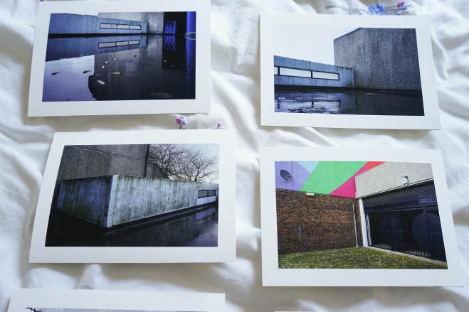
I also allowed myself a period of reflection before selecting the final shots for submission. Taking the advice of my tutor, I shot mainly landscape oriented shots and I observed this made the final set feel more focused. I also decided to get some of the images printed (see previous blog posts in Assignment Five folder) and stuck them on my wall for a few days. This allowed me to see the images ‘together’ rather than individually on the computer screen, leading me to select shots with a similar style of composition – a decision I felt helped produce a more coherent final 12. I chose to include the shots of the painted wall towards the end of the set to introduce variety and to challenge the viewer’s perception of the location. Whilst the length of time I took for the process was unrealistic for a professional context, I felt I got to practice the stages of a professional assignment. The period of reflection was an especially important part of the process, and a stage I will employ in the future when discerning the final images to submit for an assignment.


Assignment 5: People and place on assignment

Assignment Five Research: Reviewing the set

With the final submission date (27th May) looming, I took my tutor’s advice and decided to get some cheap(ish) prints of the images I was considering for submission. In the event I found a very affordable giclee printer here in London, so I thought why not and went for some prints on some very nice A5 ‘platinum etching’ paper. The images in question were the Thamesmead set posted in the previous post on the blog, a set of 16 shot on one of the elevated ‘streets’ common to the design of the estates in the area.

Having the images printed is certainly beneficial, particularly in seeing how the images work together (see below) and how I will present them in terms of order, sizing, and aspect ratio. I have already noticed things in some of the images that I haven’t noticed on the computer screen, and I may go back and rework some of the editing. While I will be spending the next couple of weeks reviewing the images and may get some more images printed, the final selection is already starting to take place and I have already cut some images. At this stage I can be 100% sure all the images will be presented in the normal 35mm aspect ratio in the landscape format. I do like how the images shot at a 45 degree angle lend a consistent feel to the set and I may keep this theme in mind when I do make the final selection.

Prints

I also feel the introduction of a wider colour palette toward the end of the set is effective (see the image on the bottom right above), however I am not 100% happy with these images and may return to Thamesmead one more time. These images could be reworked slightly to bring out the colours or to tighten up the composition. It will be worth editing on Lightroom before I make the decision to return to the location.

Prints-3

Above is a provisional selection for the final 12 images, however there are some changes to be made with certain images and I am not 100% happy with 5-6 at least.

If you are interested in some cheap and beautiful giclee prints and you are in the UK, try Zheeklay printing: http://www.zheeklayprinting.co.uk/

Assignment Five Research: Reviewing the set

Assignment Five Research: Thamesmead

Following on from my recent research in Poplar, I have been shooting in the Thamesmead area of south east London. The area is notable for hosting a vast 1960s housing estate – broken up into ‘sub-estates’ – built in the modernist/cubist style popular amongst architects and urban planners of the era (particularly those who worked for the Greater London Council). The estate is in diverging states of disrepair and upkeep, many of the properties are now privately owned and some parts have been demolished to make way for a long-term regeneration plan.

My shots are focused on the elevated ‘streets’ that dominate the estate. My original intention with the images was to focus on the facades of the housing, the textures, geometric shapes, the colours, and also the inevitable signs of decay. As I walked through the labyrinth of the ‘street’ and looked for these elements, I began to notice the shortcomings of the design. In many places it felt very dark despite it being the middle of the afternoon, there was flooding everywhere after heavy rain, and there were very few communal areas such as gardens, benches or even an area that felt welcoming or inviting.

As well as showing the material facade of the building, my images also show how a space can be poorly designed. The estate is essential a series of empty spaces, there is no impression of community from an outsider’s perspective. The space does not seem to have been designed with the intention of cultivating a community. It is inviting to theorise why the planners selected this design for such a massive estate, and if I decide to proceed with this idea and image set for my final submission I shall be providing more context to the political and social forces that created the Thamesmead estate.

Nevertheless, what is interesting is that there are still signs of individualisation within the ‘streets’, and that even within a design that appears to reject the idea of community, residents can provide a more welcoming space simply by painting a wall or by placing a few plants outside the front door. I will continue reflecting on these images whilst waiting for my film scans to return from the lab.

ThamesmeadDigital

ThamesmeadDigital-2ThamesmeadDigital-4ThamesmeadDigital-7ThamesmeadDigital-9ThamesmeadDigital-11

ThamesmeadDigital-12

ThamesmeadDigital-10

ThamesmeadDigital-13ThamesmeadDigital-14ThamesmeadDigital-15ThamesmeadDigital-16ThamesmeadDigital-17ThamesmeadDigital-18ThamesmeadDigital-19ThamesmeadDigital-20ThamesmeadDigital-21ThamesmeadDigital-22

ThamesmeadDigital-23


Assignment Five Research: Thamesmead

Assignment Five Research: Robin Hood Gardens

Following on from the black and white set of Poplar that I shared in the previous post, I opted to focus on the Robin Hood Gardens council estate.

The estate was designed in the late 1960s by the architects Alison and Peter Smithson and completed in 1972. The design, similar to the Park Hill estate in Sheffield, was founded on the concept of ‘streets in the sky’. However there were serious shortcomings on the design as the architects had to compromise on a lot of aspects. Residents would often complain about structural failings such as the persistent breakdown of the lifts and that the ‘streets’ encouraged criminal activity.

Attempts by campaigners and architects – who value the estate’s architecture as a prime example of 1960s British brutalism – to get the building listed have failed repeatedly, and so the estate has long been earmarked for demolition. My photos represent possibly some of the last taken on the estate (by an outsider), and there is a detectable sense of anticipation when walking around the estate. It is tempting to frame the photos primarily against the backdrop of the failure and subsequent demolition of Robin Hood Gardens. It could perhaps be taken as a microcosm for the failure of the ideas of the 1960s planners who sought to reshape the British urban landscape.

What I found more interesting and something that you could only observe by being at the estate, is that there is still community that clings on. It is easy to forget about the people who live there when caught up in the furore of listing applications, regeneration plans and demolition rumours. My photos show the minor arts of daily life still occurring against the backdrop of a 1960s designed council estate that now sits half empty and almost completely abandoned by the local authority.

I think these photos contain more of a focus than the previous series taken around Poplar – which was a general look at the area rather than narrowing down to a theme or idea. Also I feel these photos show much more about the people who live there (they contain people for one thing) but also show signs of normal, everyday life, despite the reputation and high level murmurings that surround the estate. I may therefore revisit RHG a couple more times (shot with a 6×7 camera, 55mm lens and colour film) to shoot with this theme/idea in mind. I like the control and limitations of 6×7 film with the wide 55mm – the slow considered approach to this area feels appropriate. Most of the images feel well composed in the landscape format although some could do with some tweaking and/or returning to shoot.

(Technique: Pentax 6×7 with 55mm lens and Kodak Portra 400 / Fuji Pro 400h mostly shot at 1/125-1/250th at F/4-F/8)

RobinHoodGardens67aRobinHoodGardens67cRobinHoodGardens67dRobinHoodGardens67eRobinHoodGardens67fRobinHoodGardens67gRobinHoodGardens67hRobinHoodGardens67iRobinHoodGardens67jRobinHoodGardens67kRobinHoodGardens67l

Assignment Five Research: Robin Hood Gardens

Assignment five research: Poplar

As part of my research for the final assignment, I have been taking my camera around areas of London and taking the observational approach I adopted for Brixton in the previous assignment. I have opted to research around Poplar in the East End, Elephant and Castle, Ladbroke Grove and areas in the City. These areas all contain modernist housing estates, the majority built in the post-war period in order to house those made homeless from bombing.

What is interesting about these estates are the ideas of community they represent, ideas that drove the 1960s urban planners to completely reimagine British cities. Prestige projects such as the Golden Lane estate in the City divide opinion but are popular enough to have listed status. The less refined architecture of inner city estates, such as Robin Hood Gardens in Poplar, are derided and often dismissed as ‘sink estates’.

What is unclear is why these places began to be perceived as harsh places of social collapse. One idea that I have been interested in pursuing is reimagining these places through a set of images that examine an estate in London (or a number of estates). I am not sure if I will be focusing on one estate, although it would perhaps provide more focus to the project if I focused on a single estate and its surrounding area. Linking back to my research on ‘deadpan’ and the ‘new topographics’ (see previous posts), I would like to present detached, observational images of these areas/estates that are an appraisal of their meaning to the people who inhabit them, and also to some degree the wider city. What my images may show is at this stage not completely determined and hinges in part on what I may observe, but the images of Poplar (see below) hopefully give some idea of what the final set may look like.

So far I have shot at Robin Hood Gardens and the Balfron estate in Poplar, the Golden Lane Estate in the City, and also at Trellick Tower in Ladbroke Grove. I have both colour and monochrome images, which I will subsequently edit and post in sets when completed. I also plan to have a look at the Brunswick centre near Russell Square and perhaps if I have time have a walk around the Thamesmead area, so I will be adding further sets over the next 2-3 weeks. I also have some images shot in Elephant and Castle, particularly around the regeneration project going on at Elephant Park and the Goldfinger designed modernist housing on the roundabout.

The set below has been shot over a period of 1-2 months in Poplar at Balfron tower and Robin Hood Gardens. The former is listed and the latter has been earmarked for demolition. It has been interesting to walk around Poplar as it is a very diverse area culturally and in terms of its architecture, however I feel including both estates in a set and focusing on the area as a whole lacks focus. I have therefore focused more on the Robin Hood Gardens estate (see next post) and have decided it is better to focus on a smaller area for a series of 12 images.

The images have potential, and the square format and Ilford film certainly convey a sense of the architectural facade and general grittiness of the area. My main doubt though is how much the images reveal to the viewer of the people who live in Poplar? Are they architecture photos? This is something to bare in mind when shooting and cutting the photos into a set.

(Technique: TLR camera and Ilford PanF film, mostly shot at 1/125 – 1/500 from F/3.5 – F/8)

RHGPoplarPanF1

RHGPoplarPanF2

RHGPoplarPanF3

RHGPoplarPanF4

RHGPanF1

RHGPanF2

RHGPanF3

RHGPanF4

RHGPanF5

RHGPanF9

RHGPanF7

RHGPanF8

RHGPanF10


Assignment five research: Poplar

A Note on ‘Deadpan’

As a follow up to the previous post on the ‘New Topographics’, my reading has led me to explore the ideas of ‘deadpan’ in photography. Although this is a term thrown around quite loosely for a wide variety of work, I would like to focus on certain artists who have attracted the moniker.

In her book ‘The Photograph as Contemporary Art’, Charlotte Cotton focuses on ‘deadpan’ and examines a fascinating series of images. One immediate reaction of the viewer is to perceive an emotional detachment on the part of the photographers – it is as if they want to convey to their audience an objective reality, devoid of the photographer’s personal interpretation. Cotton maintains that ‘the adoption of a deadpan aesthetic moves art photography outside the hyperbolic, sentimental and subjective’ (Cotton, P.81). In other words, interpreting the subjects and understanding meaning is left to the audience and ‘our sense of what the photographers’ emotions might be is not the obvious guide to understanding the meaning of the images’ (Cotton, P.81).

Perhaps one of the more interesting facts Cotton touches on is what the ‘deadpan’ aesthetic has done for photography within the art world. It can perhaps be traced back to the emergence of the Bernd Becher as an artist and those that studied under his tutelage:

‘The “deadpan aesthetic” we see today is often characterised as “Germanic”. This moniker refers not only to the nationality of many of the key figures but also to the fact that a significant number were educated, under the tutelage of Bernd Becher, at the Kunstakademie in Dusseldorf, Germany.’ (Cotton, P.82)

This school was the catalyst that broke photography education and learning away from the emphasis on it as a vocational and professional pursuit – for example with photojournalism or commercial photography – to that of ‘artistically led pictures’. The Bechers’ collaborative series of black and white photos of German industrial architecture, obsessive in its formalism and rigorous in its approach, employed large format cameras and plate negatives on which were captured industrial buildings such as cooling towers (see below).

becherstowers
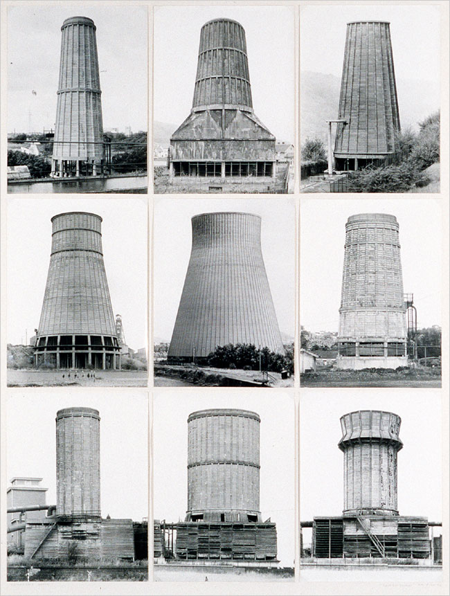
Bernd and Hilla Becher; study of concrete cooling towers; 1972


Each of the towers ‘… is photographed from the same perspective, notes on each are taken, and a typology is systematically created.’ (Cotton, P.83) The Bechers photographed the industrial landscapes of Germany and Europe at a time when it was disappearing as societies of western Europe shifted to a post-industrial world.

The influence of the Bechers’ work can be seen on their students as well, particularly with that of Andreas Gursky. He works on a large scale, using large format cameras for maximum clarity and digital post-production to refine, and exhibits hard-hitting prints that are often up to 2 metres high and 5 metres wide. What is quite unique about Gursky however is that he often creates images that are not ‘primarily contingent on being viewed as part of a series’ (Cotton, P.83). He works more like a painter than a photographer, refining a single work rather than hingeing on a set of images. His signature high vantage points leaving the viewer feeling remote from the subjects (see below), typical of the ‘deadpan aesthetic’.

Gursky stock
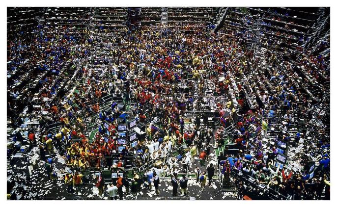
Andreas Gursky; Chicago, Board of Trade II; 1999 


In the same vain as Gurksy and the Bechers, Ed Burtynsky’s work focuses on the man-made landscape. His 12-year work on the topography of oil, perhaps best evidenced by the image below of the Californian oilfield. Cotton makes an intriguing observation concerning Burtynsky’s work:

‘While social, political, and ecological issues are embedded into his subjects, they are visualised as objective evidence of the consequences of contemporary life.’ (Cotton, P.86)

Cotton highlights that the underpinning principle of the ‘deadpan aesthetic’ is that the photographer is relaying information impartially, despite what the viewer may interpret about the artist’s intention.

burtynsky
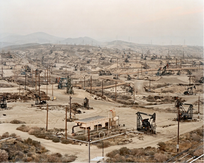
Edward Burtynsky; Oil Fields #13, Taft, California; USA 2002 © Edward Burtynsky/Courtesy of Hasted Hunt Kraeutler, New York/Nicholas Metivier Gallery, Toronto


Consequently the deadpan photographer brings personal politics into play by selecting the subject matter and ‘anticipating the viewer’s reaction to it” (Cotton, P.86) rather than through any explicit political statement through style or text.

The deadpan aesthetic is a huge field and there are a lot of artists with a wide range of subject matter. However looking at these three photographers work – quite similar in subject matter – has been fruitful in terms of informing my understanding of the ideas behind deadpan and the context artists such as Andreas Gursky learned their craft in.


References

Charlotte Cotton; The Photograph as Contemporary Art; Thames and Hudson 2004


A Note on ‘Deadpan’

‘New Topographics’

In 1975 an important exhibition called ‘New Topographics: Photographs of a Man-Altered Landscape’ appeared. In retrospective art criticism, this exhibition is ascribed as initiating a turning point in the history of photography, particularly as it was in some ways the antithesis of traditional portrayals of landscape. Photographers Robert Adams, Stephen Shore, Lewis Baltz and Frank Gohlke were commissioned to reimagine ‘the genres of topographical and architectural photography with the implications of contemporary urban generation and the ecological consequences of industry’. (Cotton, P.83). In some ways the most significant aspect of the exhibition was that these social and political agents were for the first time considered on the art gallery wall. Within this context ‘what at the time were seen as individual styles” were abandoned in favour of a detached objective style, somewhat similar in style to John Davies (see previous post) but greater in their rejection of the idealised interpretation of landscape.

At the time the exhibition was not well received by an audience that was used to the traditional landscape photography of the time. The exhibition presented 168 black and white prints of suburbia, industrial warehouses, city centres, wastelands and even seemingly banal car parks. I have selected a couple of photographs (see below) by Frank Gohlke and Lewis Baltz that are good examples of the artists presenting the aesthetic beauty of the banal, whilst revealing interesting narratives below the strict formalism in each photo. While the ‘New Topographics’ was disparaged at the time, it was crucial in opening up new opportunities for later artists. A good example of this Catherine Opie who published series called ‘Masterplan’ and ‘Mini-malls’, the inspiration for which she attributes back to the original 1975 exhibition while crafting her own interpretation of the suburbanised landscape. An example of her work is posted below as is an interesting video I came across online in which she talks about the representation of the ‘Man-Altered Landscape’ in photography.


FrankGohlke

Frank Gohlke; Grain Elevator and Lightning Flash, Lamesa, Texas; 1975; Gelatin silver print, 1996; Amon Carter Museum, Fort Worth, Texas


LewisBaltz
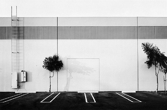
Lewis Baltz; The New Industrial Parks near Irvine, Element No. 5; California, 1977


catherineopieminimalls
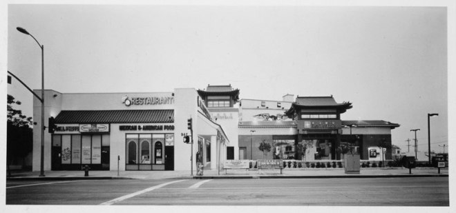
Catherine Opie; Untitled #2 from ‘Mini Mall’ series; Iris Print, 1997


The link to the interview with Catherine Opie can be found here.


The ‘New Topographics’ was certainly a revolutionary exhibit at the time, and it’s influence on practising artist up to the present day is clear to see. The idea of finding beauty in the banal and challenging the audience to look closely for historical narrative is something that will inform research for the final assignment. Depth and experimenting with formalised composition is something that I will be challenging myself to practice in an observational approach.


References: 

Charlotte Cotton; The Photograph as Contemporary Art; Thames and Hudson, United Kingdom 2004; New edition 

Catherine Opie; Catherine Opie on New Topographics; Los Angeles County Museum of Art 2009; Youtube video


‘New Topographics’

John Davies ‘The British Landscape 1979-2009’

This post will continue my examination of Davies’ work, particularly honing in on his long-term series ‘The British Landscape’, shot over a period of 30 years starting in the late 1970s.

JohnDavies1

Davies’ series shows the topography of the British Isles as a dynamic landscape in a constant state of change. His images range from conventional – but masterful in execution – images of the Lake District and Isle of Skye, to panoramas of the post-industrial landscape in the north of England. The above shot of the Stockport viaduct (built 1839) is somewhat typical of the series in showing the diverse layers of the landscape in this area of the canal. The reflections in the water show widely diverging architecture, the columns of the viaduct, the linear building of the 1970s tower block and the shadows of the Victorian warehouses on either bank.

JohnDavies2

The images divulge a sense of calm amid the changing post-industrial landscapes, perhaps best exemplified by the photograph above of the bowling greens. The choice to work in black and white also lends the series a sense of permanence, in conflict with the signs of inevitable change on view.

JohnDavies6

Perhaps the signature image in the series is the one shown above of the Agecroft Power Station in Salford. The viewer can discern a football pitch below the towering chimneys of the power station, and on the pitch humans are reduced to mere specks. This shows something of manmade scale and the human figure, and how a landscape can be shaped by human endeavour – in this image by both leisure and the need for energy. Despite the narratives that his images convey to the viewer, Davies retains a deadpan detachment in his images in a style that is reminiscent of the ‘New Topographics’. Davies states that he is not interested in ‘providing vehicles for escape but in delivering a highly crafted detailed image conveying a sense of reality’ (Davies, 2011).

JohnDavies5

What is also interesting about the series is Davies’ signature composition from elevated positions, an approach he applies to both cityscapes (as above of New Street Station) and the rural-industrial landscape. What is interesting about the images is how they show landscapes that are neither wholly urban or rural, and are tainted by the signs of change that are inevitable in a post-industrial society.

See full series on John Davies’ website.

http://www.johndavies.uk.com/


Photo and material Copyright © John Davies 1976 – 2010

John Davies ‘The British Landscape 1979-2009’

Cities on the Edge: John Davies

I have recently become interested in the work of John Davies, which sparked my research into the Cities on the Edge exhibition. Davies curated the exhibit and his own contribution to the exhibition is worth some discussion along with my own reflections as I embark on the research for the final assignment.

Davies’ style is recognisable and quite unique in its approach to capturing the urban landscape. His long term project ‘The British Landscape’ aims to show the upheavals Britain has undergone from a highly industrialised society to a post industrial society. The project focuses on the industrial heartlands of the country. His way of portraying these landscapes is subtle and understated, he states that he aims to “avoid imposing my own view of urban change” (Davies, 2012) and his visual style is distinguished by its almost panoramic views of the British landscape.

Frustratingly I found it quite difficult to source any images Davies contributed to the exhibition (I did not resort to finding a copy of the book). I did find one image of what I am assuming is Ropewalks in Liverpool, one of the areas Davies chose to document. The photo is somewhat typical of Davies’ style, especially in terms of finding a high vantage point to give the viewer a sense of the layout of the urban landscape. This choice of composition is important in giving the viewer a different way of looking at a public area, and one that most people would not get to see. Whilst this works very well with Davies’ images of very well known areas of Britain (New Street Station, Edgware Road, Elephant and Castle etc.) it is perhaps not as integral to this particular image. Even so it is important in understanding the context of the exhibit and many of those who would viewed it (in Liverpool) would perhaps be familiar with the Ropewalks area. Giving us these unusual and ‘birds eye’ style vantage points allow us to consider urban landscapes we are familiar with in a different way.

Johndaviesliverpool

The image itself is useful in showing the viewer how an urban landscape can change. We can see evidence of industrial and economic decline in the form of the run down warehouses in the background and the gutted Victorian house. The builder (?) in the florescent jacket and the development on the left hand side could perhaps be considered as agents of change. The typical working class pub on the right hand side is evidence of how some aspects of a city can be constant and show how some social mores are maintained through the generations, even in the face of industrial decline and social upheaval.

Whilst this image is a useful one to analyse and compare with other contributors to the exhibit, it is perhaps only a taster. I will try and source the rest of his images and do another post that examines the rest of his commission in the near future, and perhaps also look at Davies’ portfolio in greater depth. However, taking into account my research into the work of Taptik and Volz for the Cities on the Edge exhibit, I have outlined some points to be mindful of as I conduct the visual research for the final assignment:

  • Over the last two assignments, the focus of my photography has shifted heavily towards documenting the urban landscape. I will therefore be looking at how I can channel this focus towards a well-considered commercial or professional brief that examines an aspect of the urban landscape, considering carefully the nature of the client.
  • I will also need to decide whether I will include human subjects in my final images, and what sort of visual style I will be going for. Consulting with my tutor and gauging what the expectations are from the examiner will be vital in my final decision. Considerations about technique can also be factored into this.
  • Finally it is worth noting here some inspirations or ideas I have had concerning the final assignment. I have noted on John Davies’ website commissions (the ‘monographs’) that range from sets about French motorways (‘Autoroute A26’) to sets covering major construction projects (‘Phase 11’). Deciding upon a brief that fits similar parameters could make for an interesting project, however I will need to be mindful of time and logistical constraints.

Examining the Cities on the Edge project has been a worthwhile process and has informed the early stages of my visual research for the final assignment. I will be examining the images I have captured so far in depth and posting them on here as soon as possible, whilst continuing with my research into other artists simultaneously.

Cities on the Edge: John Davies

Cities on the Edge: Sandy Volz

Introduction

As part of the “Cities on the Edge” exhibition, designed to contrast various European port cities with Liverpool, Bremen based photographer Sandy Volz was tasked with contributing a set of images. In two cities struggling from declining commercial spheres and hard economic times, Volz chose to focus on photographing the interiors of pubs. Both Bremen and Liverpool have a long tradition of pub culture and so Volz contrasted the interior design of various establishments in both cities.

Sandy Volz2Sandy Volz1Sandy Volz 6Sandy Volz 3Sandy Volz 4Sandy Volz 5

The set is a 20 image series that utilises the 35mm aspect ratio with a portrait orientation. Shot in colour with what looks like a standard focal length, Volz focuses the attention of the camera onto the design of the space and the wall decorations. Volz states in the artist statement that the “individual aspects of these pubs’ interior styles are analysed as social and cultural signifiers” (Volz, 2008). In other words Volz reduces the elements of the frame to symbolic devices for the viewer to read  – for instance the viewer could take the Beatles memorabilia as a cultural “signifier” that gives away the pub’s location. Likewise the German flags decorating the walls of the establishment are an obvious sign of location.

Another interesting aspect the photographer touches on is the idea of the pub as “places where the private and public spheres overlap” (Volz, 2008). The interior design of the pubs appears to blend the conventional design of public spaces to that of a private home – mixing the domestic with the commercial. Each pub appears to be well used, the furniture old and worn out in places, the decorations and design also somewhat dated (for 2008). The viewer could perhaps take this as a sign of the economic hardships faced by the respective cities, and perhaps hints at the age and demographic of the ownership in each place.

Conclusions

Similar to Taptik’s series examined in the previous post, the sense of uniformity is a key aspect to Volz’s set. The choice of subject is also very interesting, especially the aspects of the pub the photographer chose to focus on. Volz’s decision to not include human subjects in the frame perhaps gives the viewer a better understanding of the social, cultural and economic context of the establishments.

This is certainly a creative approach that prompts the viewer to question and deduce where each establishment is located. Indeed it is hard to guess the location of some especially those lacking wall decorations. Perhaps the photographer aimed to diffuse the national boundaries that separate the two cities, and to reveal the common heritage and traditions of the communities within Bremen and Liverpool.

When researching and defining the parameters for the assignment five brief, it would be useful to consider the nature of the locations I will be photographing carefully. It would also be helpful to examine what each element brings to the frame, what they could signify to the viewer and how they might be interpreted. Volz successfully analysed each scene and chose to include elements that indicated aspects such as cultural and economic contexts. This in concert with the uniformity of the presentation creates a striking set of images that are somewhat different but no less powerful than others from the “Cities on the Edge” exhibit.

See the full 20 image set on Sandy Volz’s website:

http://www.sandyvolz.com/pages/work/1/2/

Cities on the Edge: Sandy Volz