Assignment Five Research: Reviewing the set

With the final submission date (27th May) looming, I took my tutor’s advice and decided to get some cheap(ish) prints of the images I was considering for submission. In the event I found a very affordable giclee printer here in London, so I thought why not and went for some prints on some very nice A5 ‘platinum etching’ paper. The images in question were the Thamesmead set posted in the previous post on the blog, a set of 16 shot on one of the elevated ‘streets’ common to the design of the estates in the area.

Having the images printed is certainly beneficial, particularly in seeing how the images work together (see below) and how I will present them in terms of order, sizing, and aspect ratio. I have already noticed things in some of the images that I haven’t noticed on the computer screen, and I may go back and rework some of the editing. While I will be spending the next couple of weeks reviewing the images and may get some more images printed, the final selection is already starting to take place and I have already cut some images. At this stage I can be 100% sure all the images will be presented in the normal 35mm aspect ratio in the landscape format. I do like how the images shot at a 45 degree angle lend a consistent feel to the set and I may keep this theme in mind when I do make the final selection.

Prints

I also feel the introduction of a wider colour palette toward the end of the set is effective (see the image on the bottom right above), however I am not 100% happy with these images and may return to Thamesmead one more time. These images could be reworked slightly to bring out the colours or to tighten up the composition. It will be worth editing on Lightroom before I make the decision to return to the location.

Prints-3

Above is a provisional selection for the final 12 images, however there are some changes to be made with certain images and I am not 100% happy with 5-6 at least.

If you are interested in some cheap and beautiful giclee prints and you are in the UK, try Zheeklay printing: http://www.zheeklayprinting.co.uk/

Assignment Five Research: Reviewing the set

Assignment five research: Poplar

As part of my research for the final assignment, I have been taking my camera around areas of London and taking the observational approach I adopted for Brixton in the previous assignment. I have opted to research around Poplar in the East End, Elephant and Castle, Ladbroke Grove and areas in the City. These areas all contain modernist housing estates, the majority built in the post-war period in order to house those made homeless from bombing.

What is interesting about these estates are the ideas of community they represent, ideas that drove the 1960s urban planners to completely reimagine British cities. Prestige projects such as the Golden Lane estate in the City divide opinion but are popular enough to have listed status. The less refined architecture of inner city estates, such as Robin Hood Gardens in Poplar, are derided and often dismissed as ‘sink estates’.

What is unclear is why these places began to be perceived as harsh places of social collapse. One idea that I have been interested in pursuing is reimagining these places through a set of images that examine an estate in London (or a number of estates). I am not sure if I will be focusing on one estate, although it would perhaps provide more focus to the project if I focused on a single estate and its surrounding area. Linking back to my research on ‘deadpan’ and the ‘new topographics’ (see previous posts), I would like to present detached, observational images of these areas/estates that are an appraisal of their meaning to the people who inhabit them, and also to some degree the wider city. What my images may show is at this stage not completely determined and hinges in part on what I may observe, but the images of Poplar (see below) hopefully give some idea of what the final set may look like.

So far I have shot at Robin Hood Gardens and the Balfron estate in Poplar, the Golden Lane Estate in the City, and also at Trellick Tower in Ladbroke Grove. I have both colour and monochrome images, which I will subsequently edit and post in sets when completed. I also plan to have a look at the Brunswick centre near Russell Square and perhaps if I have time have a walk around the Thamesmead area, so I will be adding further sets over the next 2-3 weeks. I also have some images shot in Elephant and Castle, particularly around the regeneration project going on at Elephant Park and the Goldfinger designed modernist housing on the roundabout.

The set below has been shot over a period of 1-2 months in Poplar at Balfron tower and Robin Hood Gardens. The former is listed and the latter has been earmarked for demolition. It has been interesting to walk around Poplar as it is a very diverse area culturally and in terms of its architecture, however I feel including both estates in a set and focusing on the area as a whole lacks focus. I have therefore focused more on the Robin Hood Gardens estate (see next post) and have decided it is better to focus on a smaller area for a series of 12 images.

The images have potential, and the square format and Ilford film certainly convey a sense of the architectural facade and general grittiness of the area. My main doubt though is how much the images reveal to the viewer of the people who live in Poplar? Are they architecture photos? This is something to bare in mind when shooting and cutting the photos into a set.

(Technique: TLR camera and Ilford PanF film, mostly shot at 1/125 – 1/500 from F/3.5 – F/8)

RHGPoplarPanF1

RHGPoplarPanF2

RHGPoplarPanF3

RHGPoplarPanF4

RHGPanF1

RHGPanF2

RHGPanF3

RHGPanF4

RHGPanF5

RHGPanF9

RHGPanF7

RHGPanF8

RHGPanF10


Assignment five research: Poplar

A Note on Alexander Gronsky

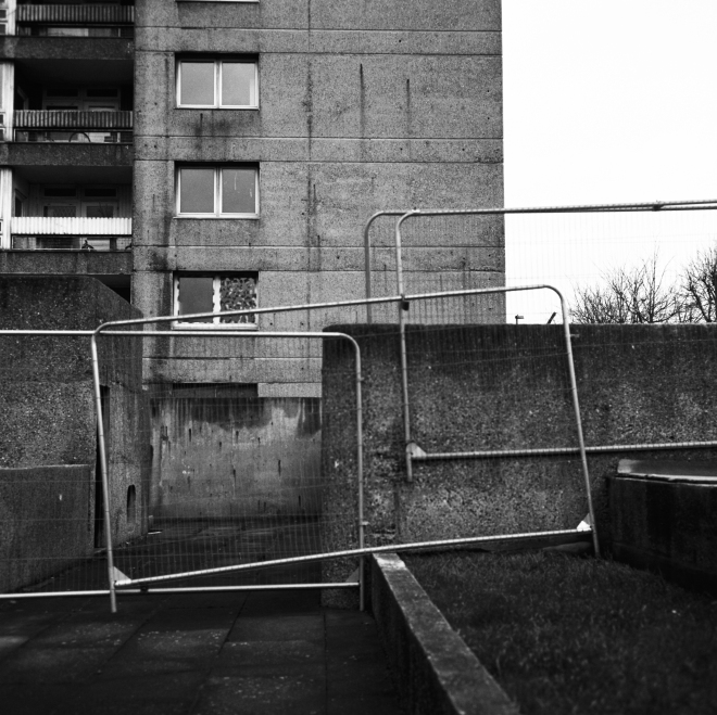
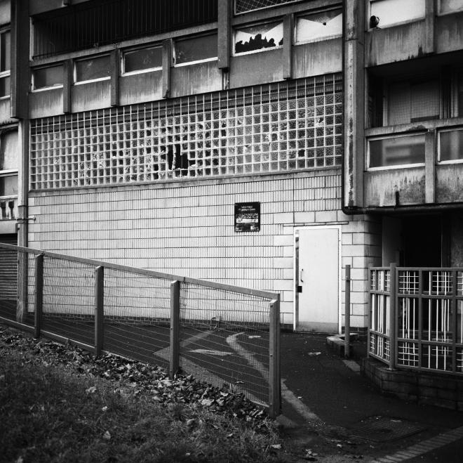
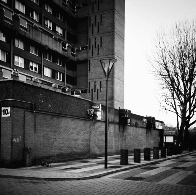
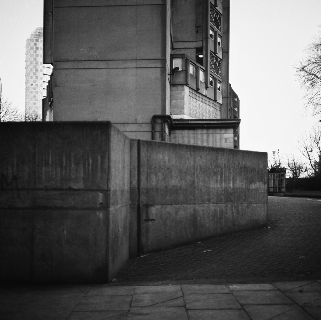
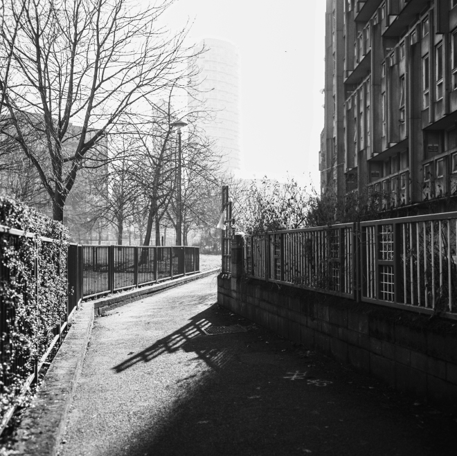
*This post forms part of my preliminary research for Part Four “People Interacting with Place”.

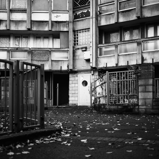
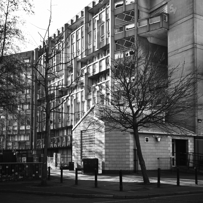
Linking back to my reflections on my learning experiences from Part Three, I conducted some preliminary research to maintain the momentum gained from assignment three. One of the locations I covered in this assignment to demonstrate the function of buildings in use was a fairground in Coney Island, New York. Although it was a loose interpretation of the assignment brief, I feel I was successful in showing the viewer the function of the space and temporary structures in my images. The use of place for leisure and recreation is a subject that has intrigued me, particularly in light of the brief for the upcoming assignment four.

‘Pastoral’

One photographer I identified as relevant and worthy of discussion is the Russian landscape photographer Alexander Gronsky.

gronsky

a) From Alexander Gronsky’s ‘Pastoral’ (2008-2012) 

Gronsky is a former press photographer who covered events in Russia and the former USSR in the 2000s before moving into advertising and commercial photography for corporations and humanitarian organisations. He has placed more emphasis on personal projects in recent years and conducted a series of exhibitions, published a book and received awards for his work. He is known for his photographs of Russian landscapes, using a Mamiya 6×7 camera with colour film.

One of his series ‘Pastoral” caught my eye immediately (see image above). The series observes Muscovites at leisure around seemingly man-made lakes and industrial wastelands on the edge of Moscow in summer-winter months. What is very striking about the images is how his human subjects make use of a space – neither city nor countryside – not intended for recreational activity. We see people swimming in a river of questionable water quality, people sunbathing among dense entanglements of weeds and thorns, and families playing games next to heaps of sand dug up by industrial diggers. The series has a penchant for the surreal, we glimpse someone shooting an air rifle and someone undressing in some trees. As a kind of backdrop to these leisure activities, which seem to make up the majority of the activity, there is the ever present industrial landscape that overshadows this man-made natural landscape.

gronsky2

b) From Alexander Gronsky’s ‘Pastoral’ (2008-2012) 

What this series shows is that recreational activity does not necessarily have to take place in a place intended for leisure. For the Muscovites living on the edge of Moscow, perhaps located a significant distance from the nearest park or unable to afford to travel far, this is the only space they have to make the most of their days off. Although we don’t see the people in his photos up close (often appearing as figures in the distance) we get the impression that the people are enjoying their surroundings. The full set is a long term project that consists of a final 40-50 images and can be found on Gronsky’s website here:

http://alexandergronsky.com/#/portfolio/works/pastoral-2008_2012/26

‘Mountains and Waters’

Linking back to my conclusions from assignment three, another of Gronsky’s projects is also worth looking at. It is interesting to note how he presents his work in the series ‘Mountains and Waters’, a set of images that examines the changing landscapes of China.

Gronskyc) From Alexander Gronsky’s ‘Mountains and Waters’ (2011) 

What is interesting about the series is the presentation of the works in diptychs, that is two images set beside each other. In the exhibition notes he links the idea behind the series to the word for landscape in Chinese – a compound of two symbols for mountain (山) and water (水). This duality in his presentation is evident in the use of the diptych to exhibit the resulting images. He also links this choice of presentation to Shan Shui painting tradition, where the intention of the artist was not to represent one single place or landscape, but rather to present a ‘metaphor of a human journey through a constant shift between nothingness and form.’ (Gronsky, 2011) It is apparent that although Gronsky presents two images together, there is an element in both that creates a visual narrative (see image above) that unifies and blends the two into something resembling a panoramic landscape photograph (see image below).gronskyd) From Alexander Gronsky’s ‘Mountains and Waters’ (2011)

While Gronsky was not primarily concerned with leisure or recreational activity in this series, his choice of presentation is something to consider for the future assignments. It is clear that Gronsky thought deeply about his presentation and researched traditional Chinese art and the philosophy behind it. This tradition influenced his choice of presentation, and it works very well in seamlessly contrasting old and new (c) and placing his distant human figures within huge environments that are neither totally man-made nor wholly natural (d). He also cleverly uses the diptych to hint at a story or narrative – has the figure on the boat in (d) become the figure in the smaller boat under the bridge? He also sometimes knits together his panoramas, often loosely as in image (e) as the two images were taken at different times. He is not bothered about disguising this and yet the images feel like they are in perfect harmony.

Gronsky

e) From Alexander Gronsky’s ‘Mountains and Waters’ (2011)

What his presentation does is consistently ask questions of the viewer and again, as with the ‘Pastoral’ series, has a penchant for the surreal and the eccentric. The ‘Mountains and Waters’ set is again an extensive series and can be found on Gronsky’s website (follow link below):

http://alexandergronsky.com/#/portfolio/works/mountains-and-waters-2011/3

Reflections

A major point I will consider in future submissions is how my final images are to be presented – should they be presented in the same format? With the same aspect ratio? Should one image be made bigger to emphasise a subject? Could an image work better in a diptych or even in triptych? Or do the images work better in a sequential set?

It is clear that the way in which the photographer presents the final set of images could be considered before even a shot is taken, and in Gronsky’s ‘Mountains and Waters’ series the presentation was at the heart of the project. Considering whether you would like to present your images sequentially with forms of visual punctuation (such as emphasising one subject over another), or whether you would like to juxtapose your subjects in diptychs can inform the photographer’s approach to a location. This could be described as a very measured approach to photographing a place, and it could be harder to include the spontaneous event or the unexpected. It is certainly an approach I will consider for the upcoming exercises and in my research for assignment four.

A Note on Alexander Gronsky

Part 3 Reflections

Having completed assignment three and had some time for reflection, I thought it useful to write up some conclusions I had from the process and provide some more background for the choice of locations and technique. In addition, this reflection should also reveal the rationale behind the final images I chose for the submission. I have included images I chose to omit to help illustrate some of the thoughts and conclusions I had about the final submission.

*Note that all of the images below were omitted from the final submission and should not be considered as part of assignment three

Ironically I found the most challenging part of the assignment photographing the most mundane locations, i.e. the shopping centre and library interior. Whilst working through the exercises and projects, I had set on a couple of locations for the assignment with quite obvious functions – a fairground and housing estate. What was interesting with the housing estate (Barbican set) was that as I got to know the location better, I began to see more uses and functions. I was also very taken in by its form and architectural design and found myself focusing too much on these aspects rather than the functional aspect of the space. Gradually I became aware that this was pulling my focus away from the assignment brief. The four images I selected showed various uses of the space, whereas those I decided to omit were either too similar to the ones I had selected, or were overly focused on form. A selection of those I decided to leave out are posted below.

Barbican-3 Barbican1

Barbican-5 Barbican-7Barbican-2  Barbican-6

One image I might have included was the park and the person walking across it. It shows part of the residential space of the estate but demonstrates a slightly differing function – a leisure space. This is something that could have been included in a larger project or series, but I decided that it was too similar to the residential uses I had shown in the other images. Also I thought it was perhaps a bit wayward of the assignment brief and was not focused enough on ‘building’ or the idea of a structure. However the idea of a leisure space is something that I found interesting and is an idea that I will come back to later.

The images of the Coney Island fairground I chose to omit were not particularly focused on the idea of a building in use. The ones I had chosen to include were rather a loose interpretation of the brief as well, but close enough to demonstrate a functional structure (for instance the ticket office. Again exploring this location again or one that I would have access to near to where I live would be an idea worth pursuing, perhaps fitting into the idea of a leisure/recreational space. A selection of images I chose to omit for the Coney Island location are below.

ConeyIsland-2 ConeyIsland-3 ConeyIsland-4 ConeyIsland

I felt the images of the outdoor cinema and the people on the benches were too loose an interpretation of the brief. I chose to select one image of the ferris wheel, the two I chose to omit were perhaps again too vague but I did enjoy the rather abstract capture of the roller coaster on the left. It would be interesting to see if it could fit into a larger project or more varied series of images focusing on a leisure/recreational space. Experimenting with visual narrative and finding “visual punctuation” in a series of images is something touched upon by Maria Short in ‘Context and Narrative’:

“It can be possible to achieve a certain pace in the series by using a particular size or shape of image at a key point in the sequence, either as a recurring theme or a one-off.” (Short, 2011, P.106)

Experimenting with narrative and presentation of images is something that I will be researching and attempting to do, certainly for the part four assignment and perhaps in a retrospective presentation of the images I made for the part three assignment. It would have been interesting to present the images I made for assignment three in a less uniform way, for example increasing the prominence of one image by increasing its size or messing with its aspect ratio. Observing the presentation of work by other photographers and how this can change visual narrative is something that I will come back to and research later.

My initial approach to photographing the shopping centre in Stroud can be seen in the images I chose to omit. I had the problem of shooting the complex’s obvious function when I first approached it and the resulting images were somewhat flat and uninteresting. It was after I had walked around the entire complex and saw how it fit into the Stroud town centre that I saw a function besides the obvious use as a shopping centre. The omitted images below show this function whereas those I chose to submit in the finished set demonstrate more creativity and a more interesting visual narrative.

Merrywalks-2

Merrywalks-3

Merrywalks

A takeaway point from this location (and that I considered immediately) is that it is always important to research and consider your location before approaching it. My intention when shooting Merrywalks was somewhat arbitrary, as I was thinking about its obvious function as a place to shop in. After walking around and considering its place within the town centre as a meeting point for young people, I approached the location in a more creative manner and I think the images I chose to submit possess a more engaging narrative for the observer.

This point was also very relevant with my approach to photographing the mills. It was only after I had shot a few frames and had considered how I could create a visual narrative for the audience that I approached the location in a different, more creative way. As I was shooting I found a potential narrative in juxtaposing the modern with the old. I saw the sports car parked under the Victorian railway bridge with the mill in the background, and saw the opportunity to contrast the modern office function with the traditional function of the mill as an industrial workspace. The images I omitted from the submission are presented below, and are devoid of any social/visual narrative I think is present in the set I submitted. Similar to my initial approach in photographing Merrywalks, the first frames I took at the mill are quite straightforward and only really show the original function of the buildings.

stroudmills-2 stroudmills-3 stroudmills-4 stroudmills

To conclude, I feel I approached this assignment in a much more thoughtful and creative way compared to assignment two. I was quite pleased with the submitted images for each of the five locations and I came away with some very useful learning experiences and ideas for future research. Although I have talked about these in the above text, I have bullet pointed the ideas below for ease of future reference.

  • It is important to research and walk around a location before shooting it and to consider how you would present the location in a series.
  • It is useful to ask yourself if there is any narrative present besides the obvious, and if you could approach photographing a location in a unique way.
  • Consider ways of presenting your final images in a set – are there subjects you could emphasise over others? How could you emphasise this within the set?
  • Could you change aspect ratio, size or bring in other visual aspects to achieve a visual punctuation within the narrative?
  • Taking away ideas such as leisure and recreational spaces, and how people interact with these spaces for my work/research in Part Four.

Having already done some preliminary reading for Part Four, these points are relevant learning experiences and ideas to bare in mind for work/research in Part Four. Although I am aware that the research and execution of assignment four may take a while, I am keen to keep up the momentum gained from Part Three and have already begun research for the next assignment and projects in Part Four.

Part 3 Reflections

Assignment three: buildings in use (Set 5)

For the fifth set of images in this assignment, I chose to shoot at the Barbican estate in London. I find the complex an interesting place due to it being a great example of 1970s Brutalist design and still seemingly functioning – at odds with the rejection of Brutalism by contemporary society. It is controversial for many Londoners due to its ugly aesthetic and association with 1970s urban planning. However it is the organisation of the complex and its varied use which makes it an engaging space. I therefore set out to attempt to capture the Barbican’s contemporary functions again using my Rolleiflex camera for the sake of continuity with the other sets of this assignment. I decided to use Fuji Provia slide film in order to obtain as clear scans as possible and also because I thought the muted tones of Provia would be more suitable than more saturated colours of a negative film. I was tempted to use black and white film, but I decided upon colour in order to capture accurately how it is seen by visitors and residents. In hindsight I think I should have used faster colour negative film as the Provia resulted in a lot of blocked shadows and blown highlights.

Barbican6

I shot a lot of images at the Barbican so deciding upon three or four was difficult. The image above shows the harshness of the concrete structure contrasting with the natural colour of the flower beds laid out by the residents. The image gives a strong sense of an overpowering urban environment, but perhaps in defiance of this the residents seek to create their own space on the balconies of their flats.

Barbican9

It is easy to imagine that growing flowers in an environment dominated by concrete gives residents a sense of ownership over the space. I shot the above image looking down onto an underground car park beneath the estate. I did not expect to see signs of residence when looking down upon three subterranean levels of concrete.

Barbican(resize)8

Despite the signs of residence and community on the estate, there were points where I was reminded of its location within a busy part of London. The above image shows part of the complex which is given over to offices and the performing arts centre. The bike path was busy and full of commuters whilst I was walking around, travelling between the estate’s offices, flats and nearby tube station.

Barbican13

The final shot shows an architects’ office with people busy at work. This demonstrates one of the estate’s contemporary uses alongside its original function as a residence for working class Londoners. It’s success as a space seems to be rooted in its continued occupancy by a community of residents who value the flats they reside in, its use as a performing arts centre (one of the largest in Europe) and its occupancy by private firms such as the architects’ office. This set therefore accurately shows the complex’s various functions and how the estate continues to successfully function despite the controversy and divided opinion over its aesthetic and design.

Assignment three: buildings in use (Set 5)

Assignment three: Buildings in use (Set 3)

Merrywalks2

For the third part of Assignment Three, I chose the location of Stroud’s Merrywalks centre. A shopping, cinema and multi-storey car park typical of 1960s town planning, I walked around the centre on a Saturday afternoon. I aimed to find a function beyond the obvious shopping and cinema going function, and looked to show how the complex fits into the everyday life of Stroud’s town centre. I again selected my Rolleiflex camera with Kodak Portra for natural colour reproduction, and also for subtlety as I was aware that I would be shooting on the street.

Merrywalks3

Stroud is a small market town in the Cotswolds, so Merrywalks is somewhat of an eye sore when placed next to the quite picturesque buildings of the small centre. The complex is so big in comparison that it actually obscures the view of Stroud when you drive in. The construction of the cinema and, much later, the McDonalds saw strong opposition from locals. In the 1970s the Stroud District Council attempted to destroy much of the town’s old centre to make way for further developments alongside Merrywalks. It was thanks to action from local people that much of this was averted but the centre has survived well into the 21st Century despite being somewhat neglected (except for the cinema).

Merrywalks1

The interior of the shopping area in the centre feels empty next to the vibrance of Stroud’s centre which is especially busy on a Saturday thanks to the Farmers’ market. The position of the centre right on the main road through Stroud (and so all the bus routes) and the popularity of the cinema of course make it a natural point of congregation in Stroud. Despite its somewhat neglected appearance, it still retains its function as a transport hub and car park for shoppers and market goers headed into Stroud. Being the school holidays I noticed large groups of school children congregating in the half empty car parks and shopping areas of the centre, a telling sign perhaps of its neglect but also of its position in the town centre and proximity to residential areas and bus routes.

Merrywalks4

Assignment three: Buildings in use (Set 3)